ggplot(data = mpg, aes(x = cty, y = hwy))
ggplot2; Introduction to InferenceWe’ll follow the ggplot2 cheatsheet, available at https://posit.co/wp-content/uploads/2022/10/data-visualization-1.pdf.
By the way, there are many more cheatsheets for different aspects of R and RStudio available at https://posit.co/resources/cheatsheets/.
ggplot(data = mpg, aes(x = cty, y = hwy))
The above code doesn’t produce a plot by itself. We would have to add a layer, such as a geom or stat. (Every geom has a default stat and every stat has a default geom.) For example,
ggplot(data = mpg, aes(x = cty, y = hwy)) +
  geom_point()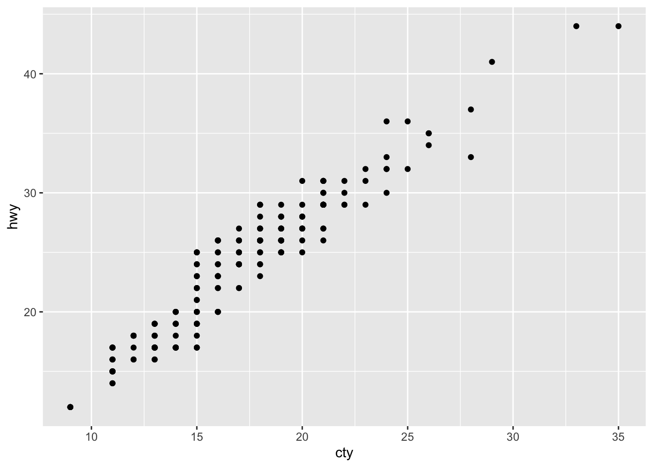
adds a scatterplot, whereas
ggplot(data = mpg, aes(x = cty, y = hwy)) +
  geom_point(aes(color=displ,size=displ))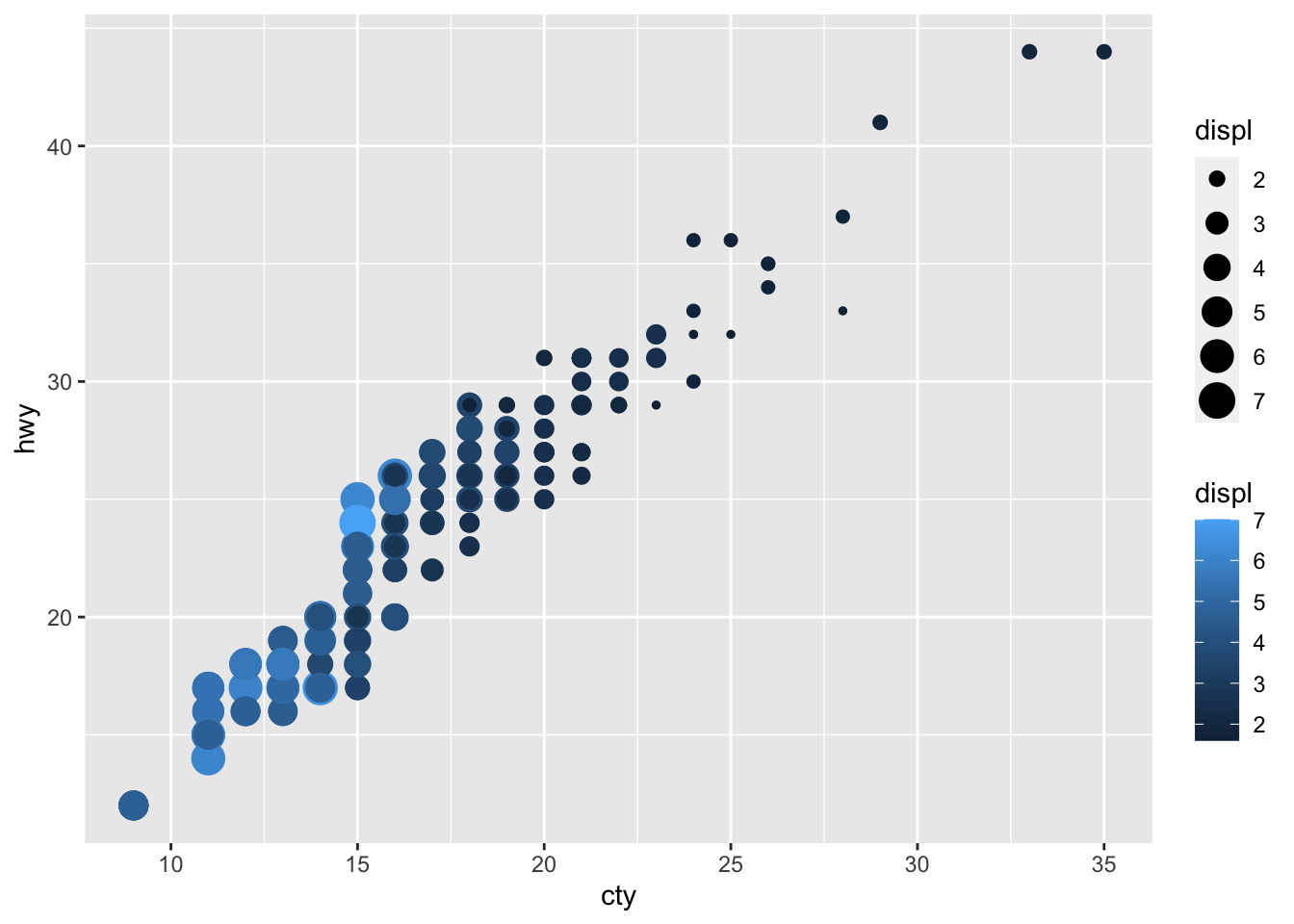
adds the aesthetics from the second example on the cheatsheet.
a <- ggplot(economics,aes(date,unemploy))
b <- ggplot(seals,aes(x=long,y=lat))
a + geom_blank()
a + expand_limits()Warning in max(lengths(data)): no non-missing arguments to max; returning -Inf
b + geom_curve(aes(yend = lat + 1, xend = long + 1), curvature = 1)
a + geom_path(lineend = "butt", linejoin = "round", linemitre = 1)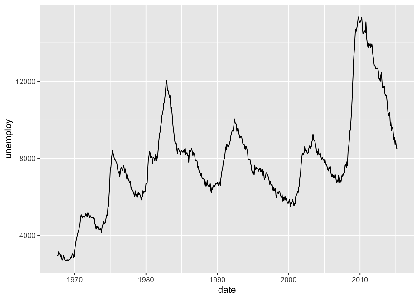
a + geom_polygon(aes(alpha = 50))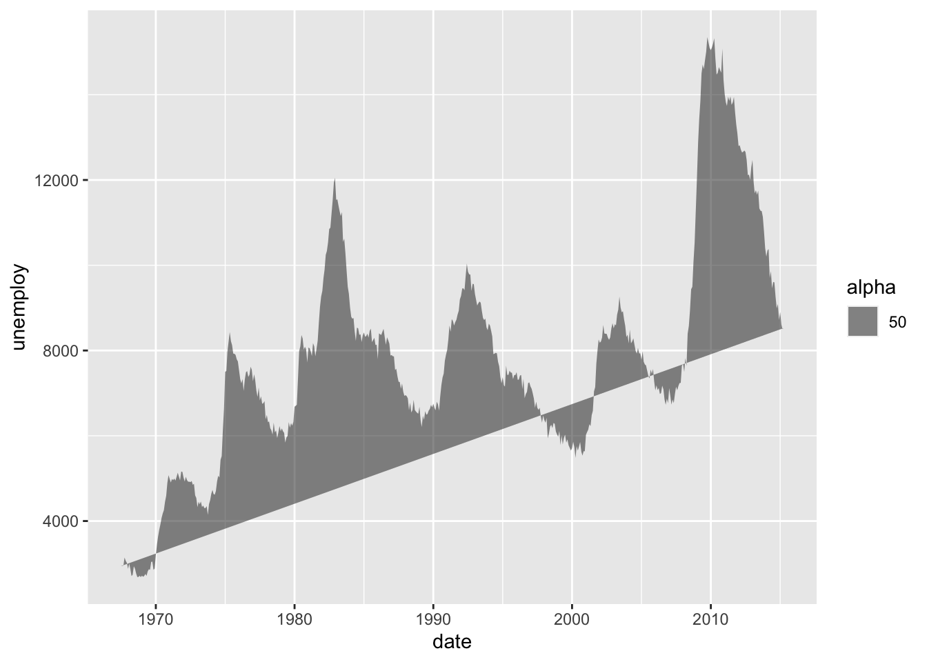
b + geom_rect(aes(xmin = long, ymin = lat, xmax = long + 1, ymax = lat + 1))
a + geom_ribbon(aes(ymin = unemploy - 900, ymax = unemploy + 900))
b + geom_abline(aes(intercept = 0, slope = 1))
b + geom_hline(aes(yintercept = lat))
b + geom_vline(aes(xintercept = long))
c <- ggplot(mpg, aes(hwy)); c2 <- ggplot(mpg)
c + geom_area(stat = "bin")
c + geom_density(kernel = "gaussian")
c + geom_dotplot()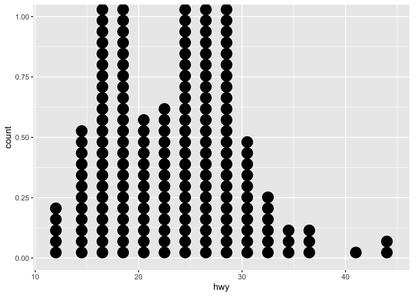
c + geom_freqpoly()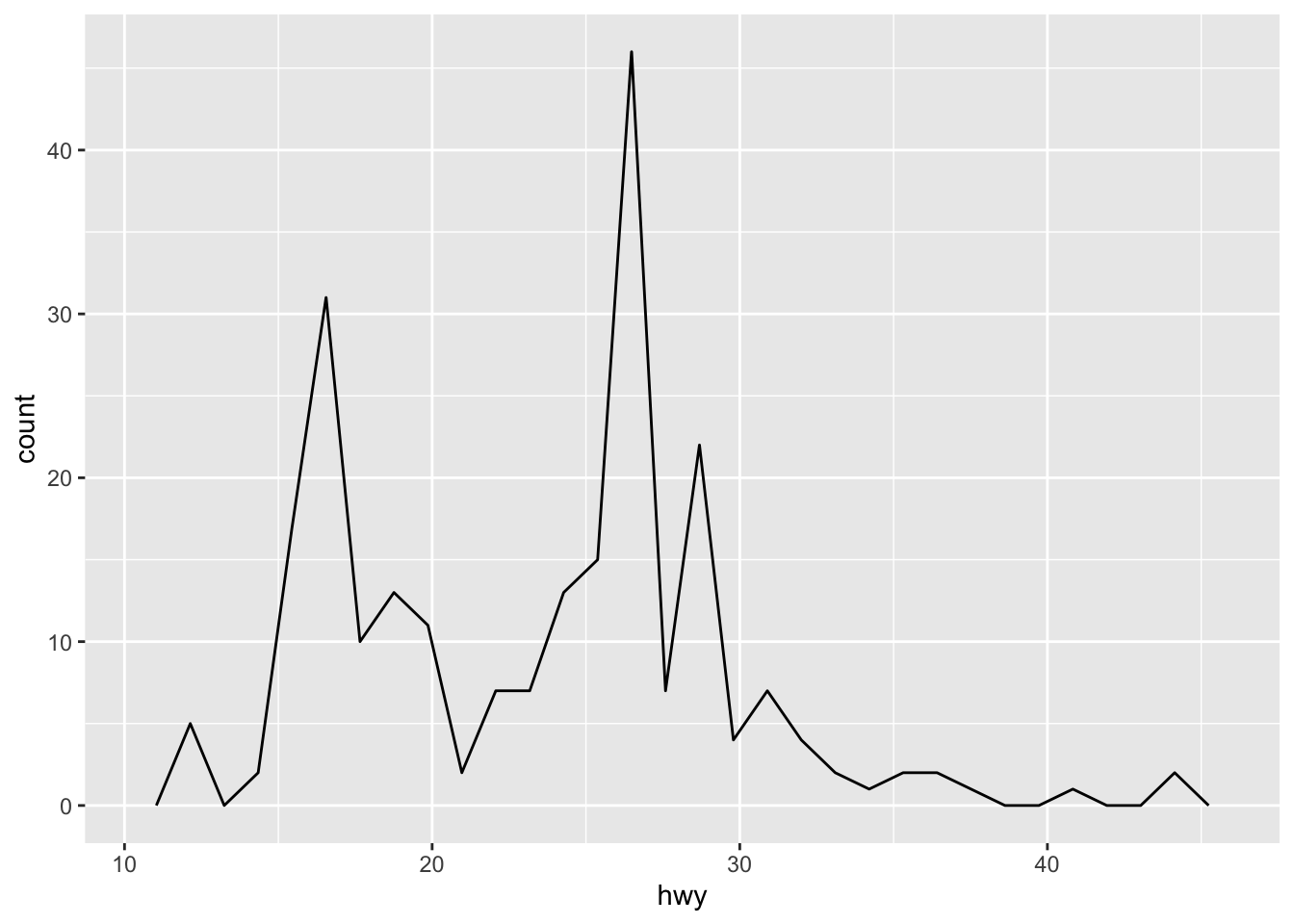
c + geom_histogram(binwidth = 5)
c2 + geom_qq(aes(sample = hwy))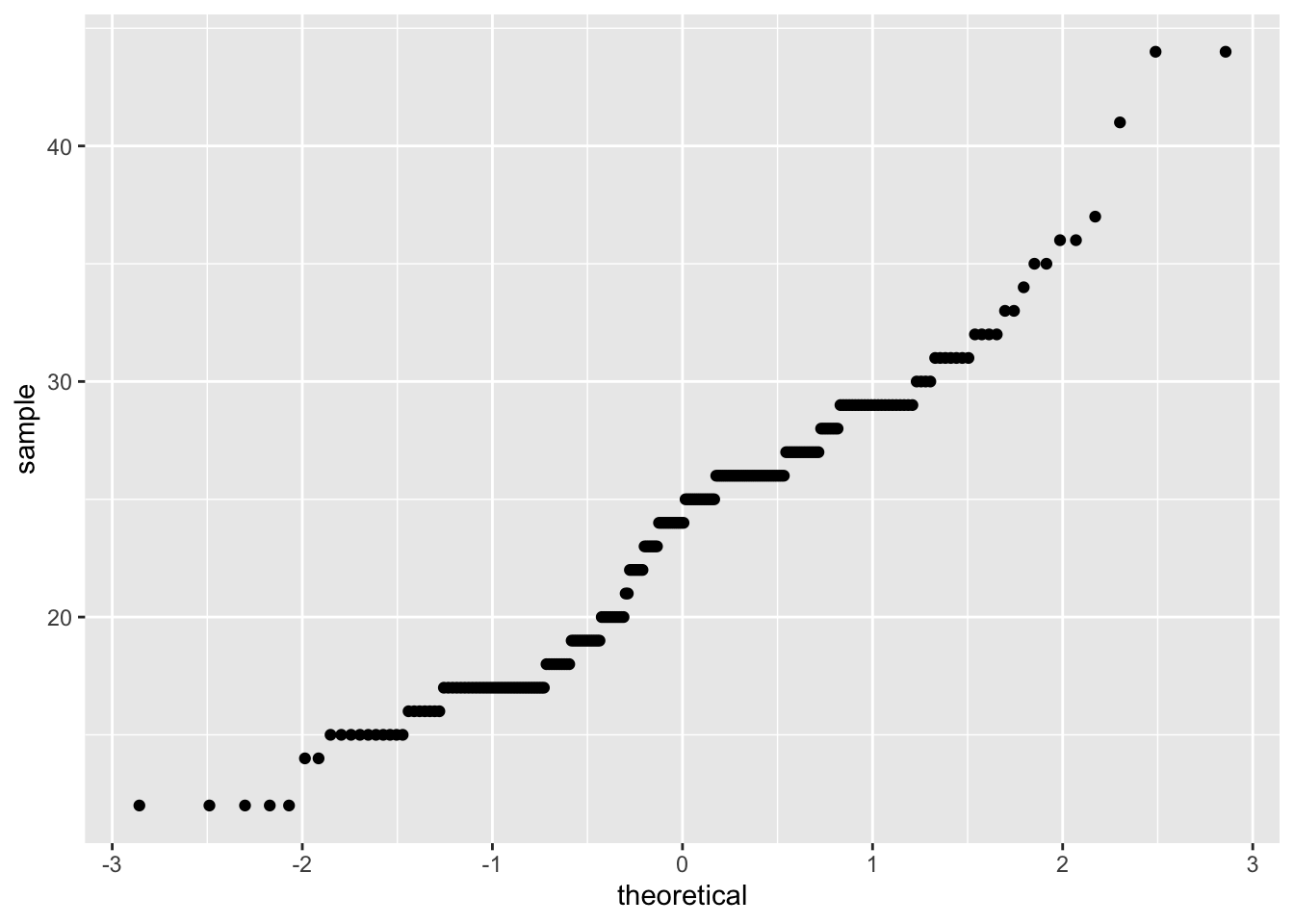
d <- ggplot(mpg, aes(fl))
d + geom_bar()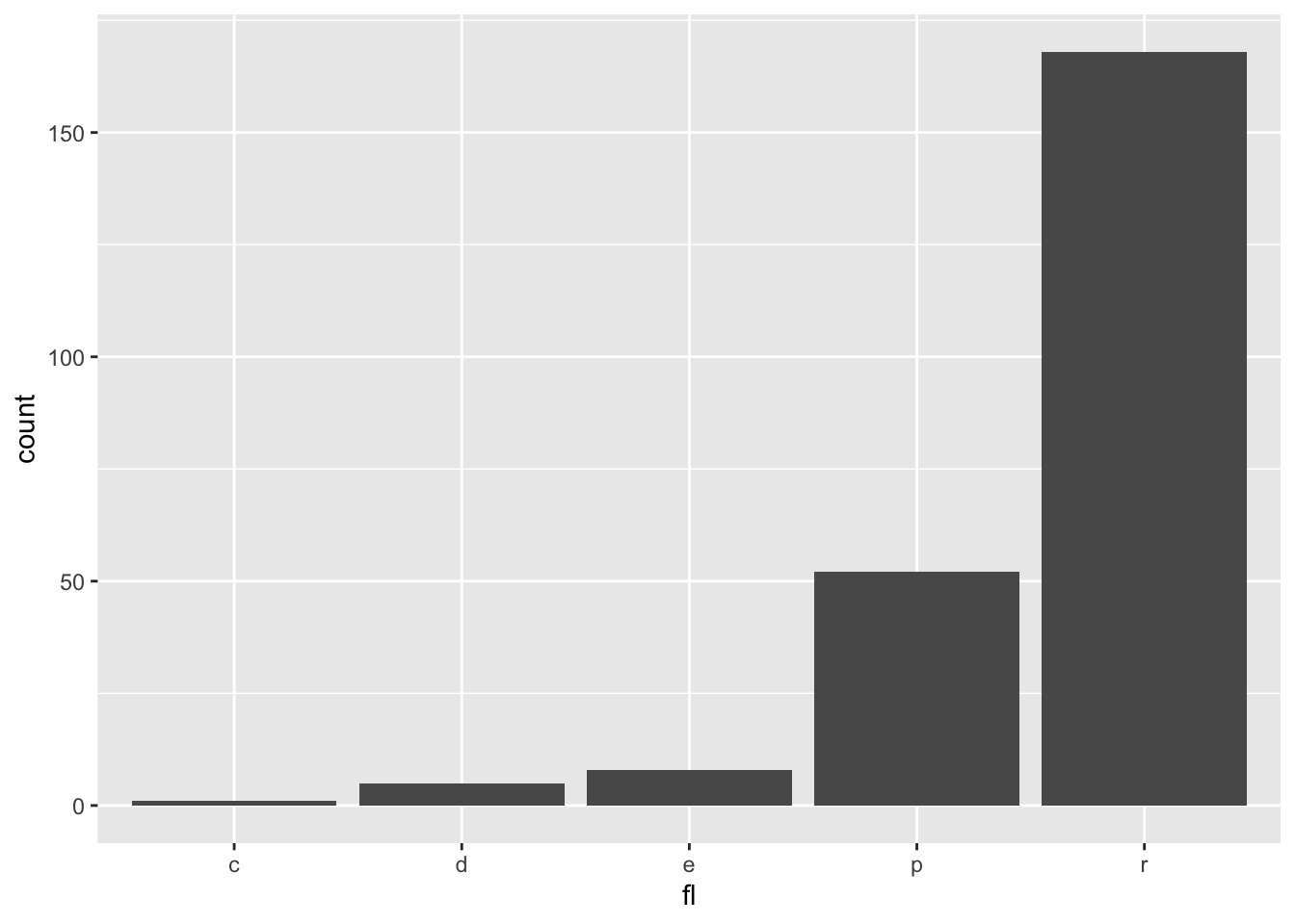
e <- ggplot(mpg,aes(cty,hwy))
e + geom_label(aes(label = cty), nudge_x = 1, nudge_y = 1)
e + geom_point()
e + geom_quantile()
e + geom_rug(sides = "bl")
e + geom_smooth(method = lm)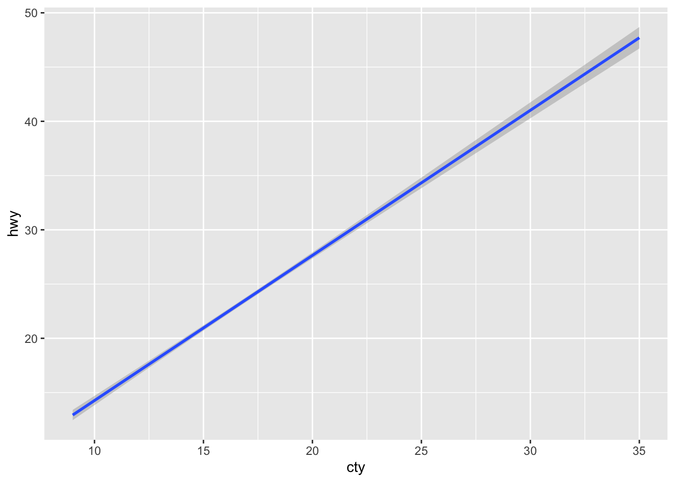
e + geom_text(aes(label = cty), nudge_x = 1, nudge_y = 1)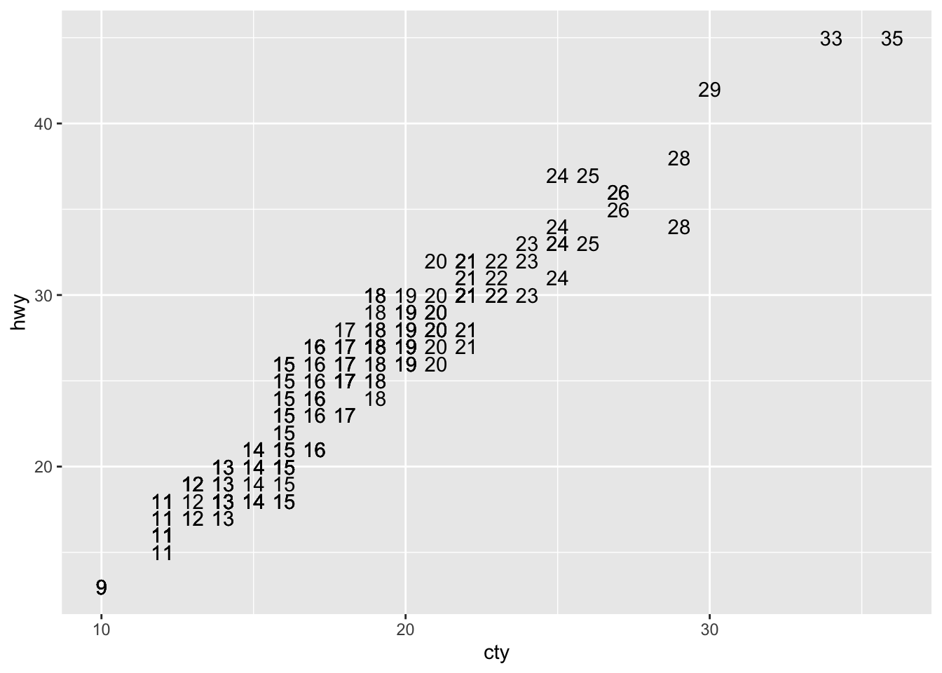
f <- ggplot(mpg,aes(class,hwy))
f + geom_col()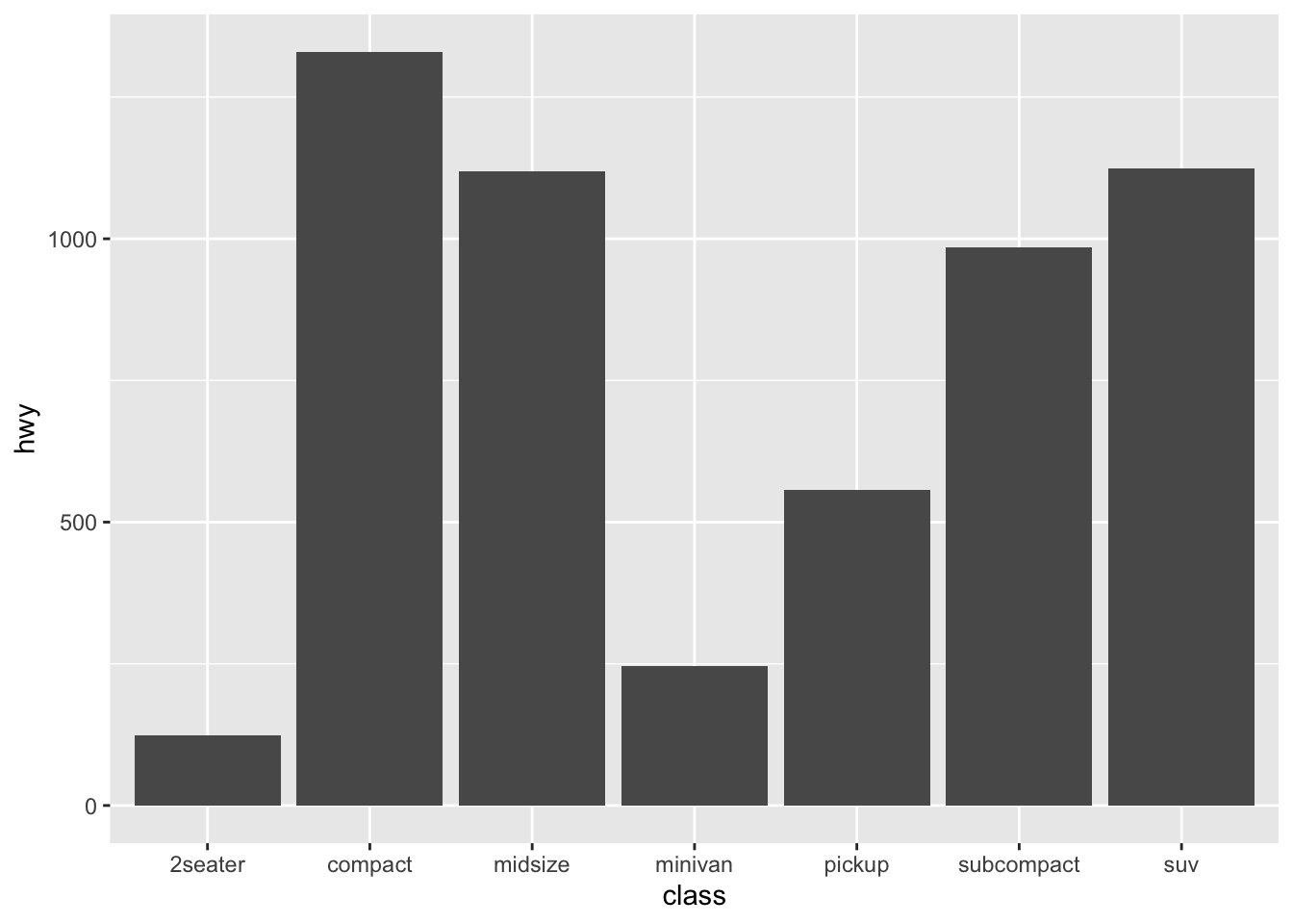
f + geom_boxplot()
f + geom_dotplot(binaxis = "y", stackdir = "center")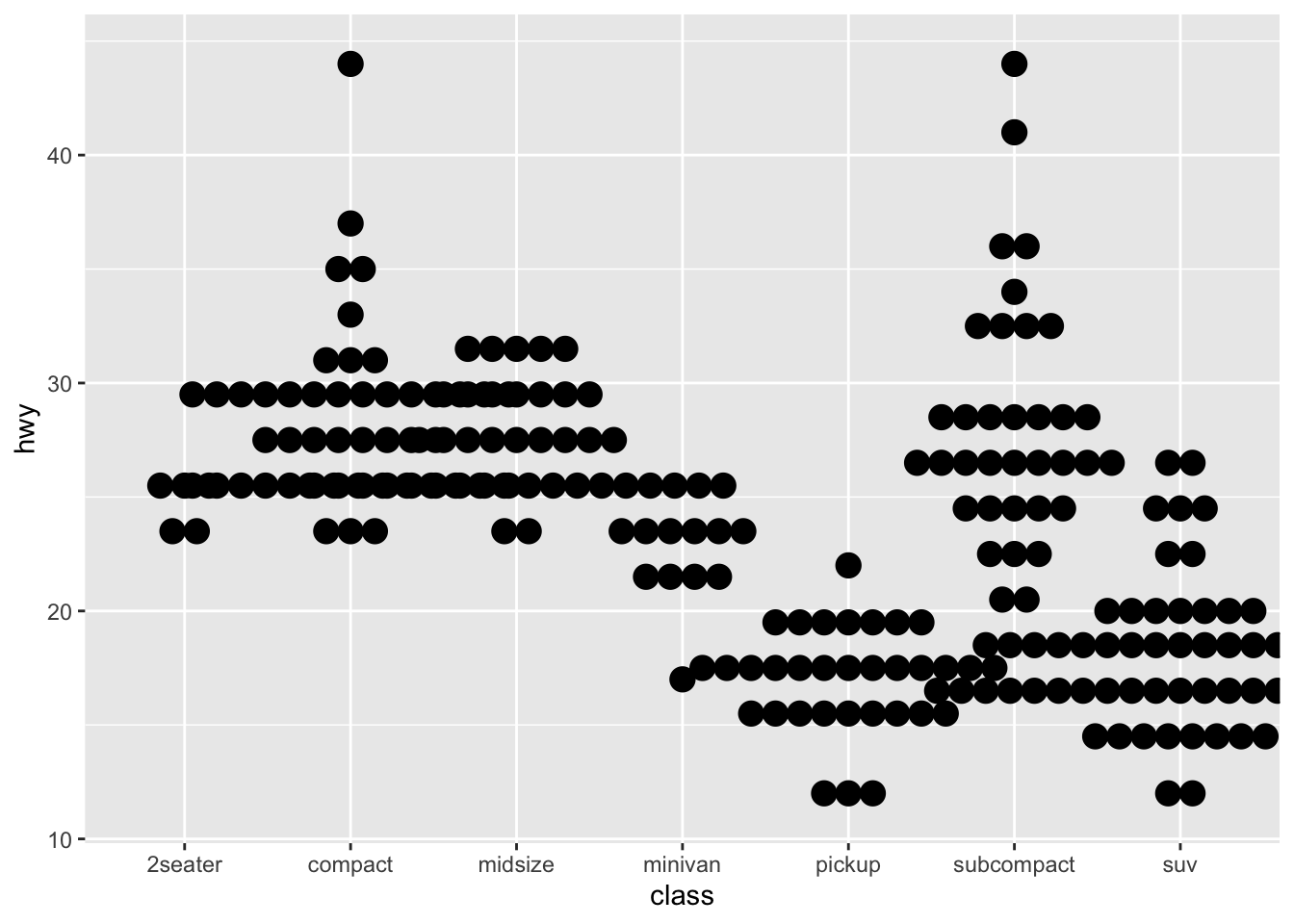
f + geom_violin(scale = "area")
g <- ggplot(diamonds, aes(cut, color))
g + geom_count()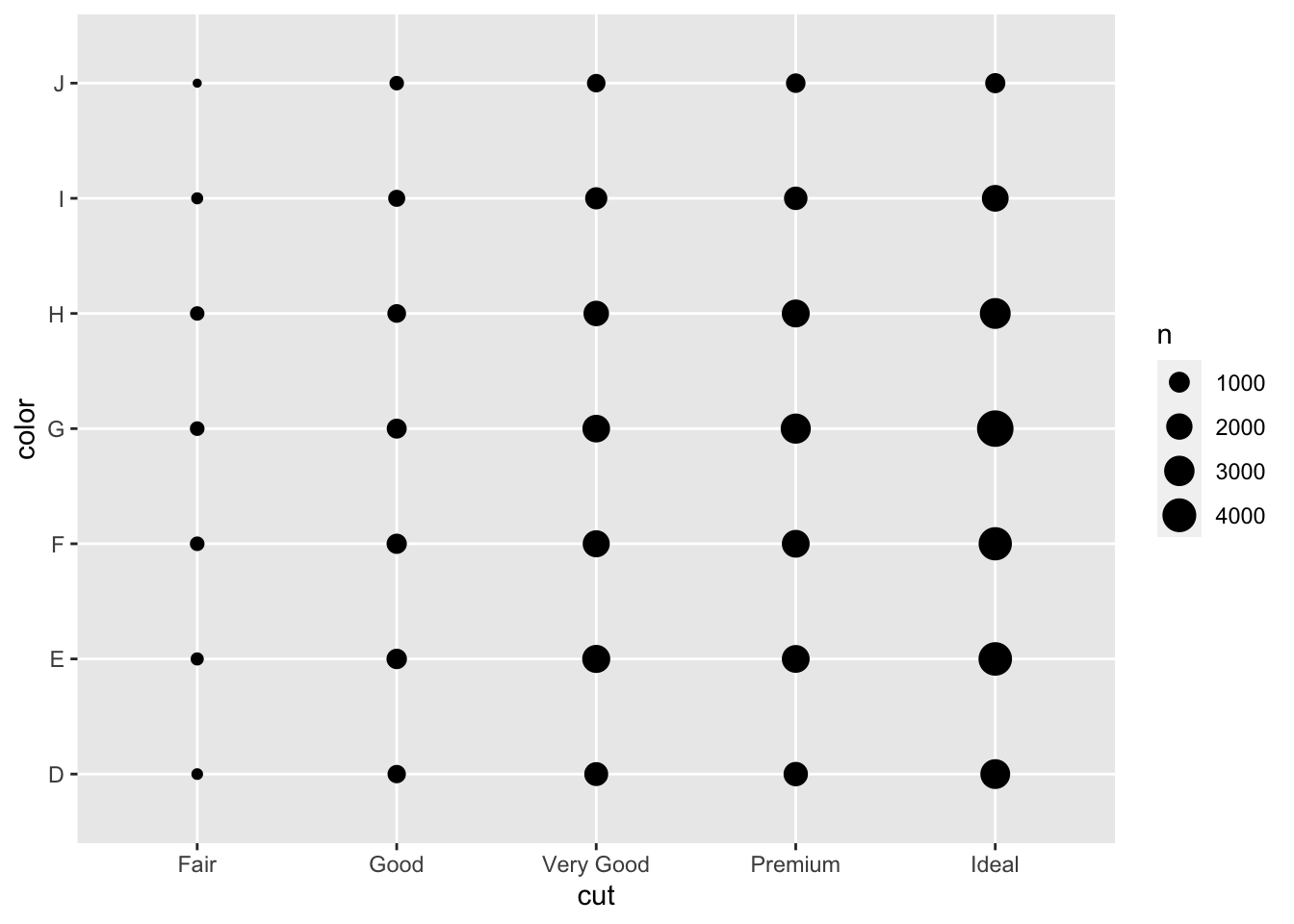
g + geom_jitter(height = 2, width = 2)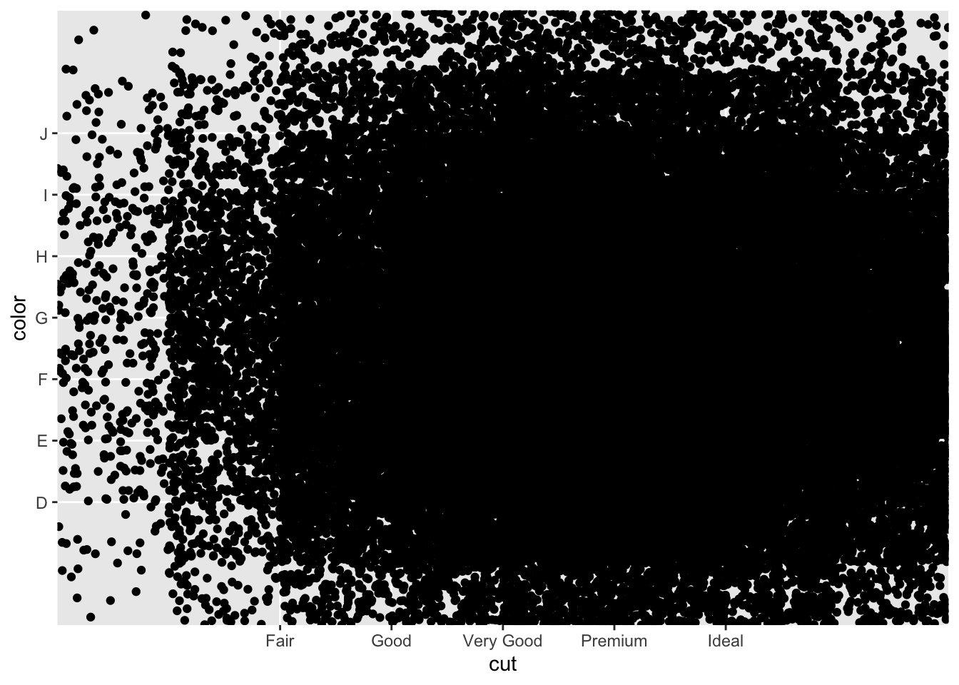
h <- ggplot(diamonds, aes(carat, price))
h + geom_bin2d(binwidth = c(0.25, 500))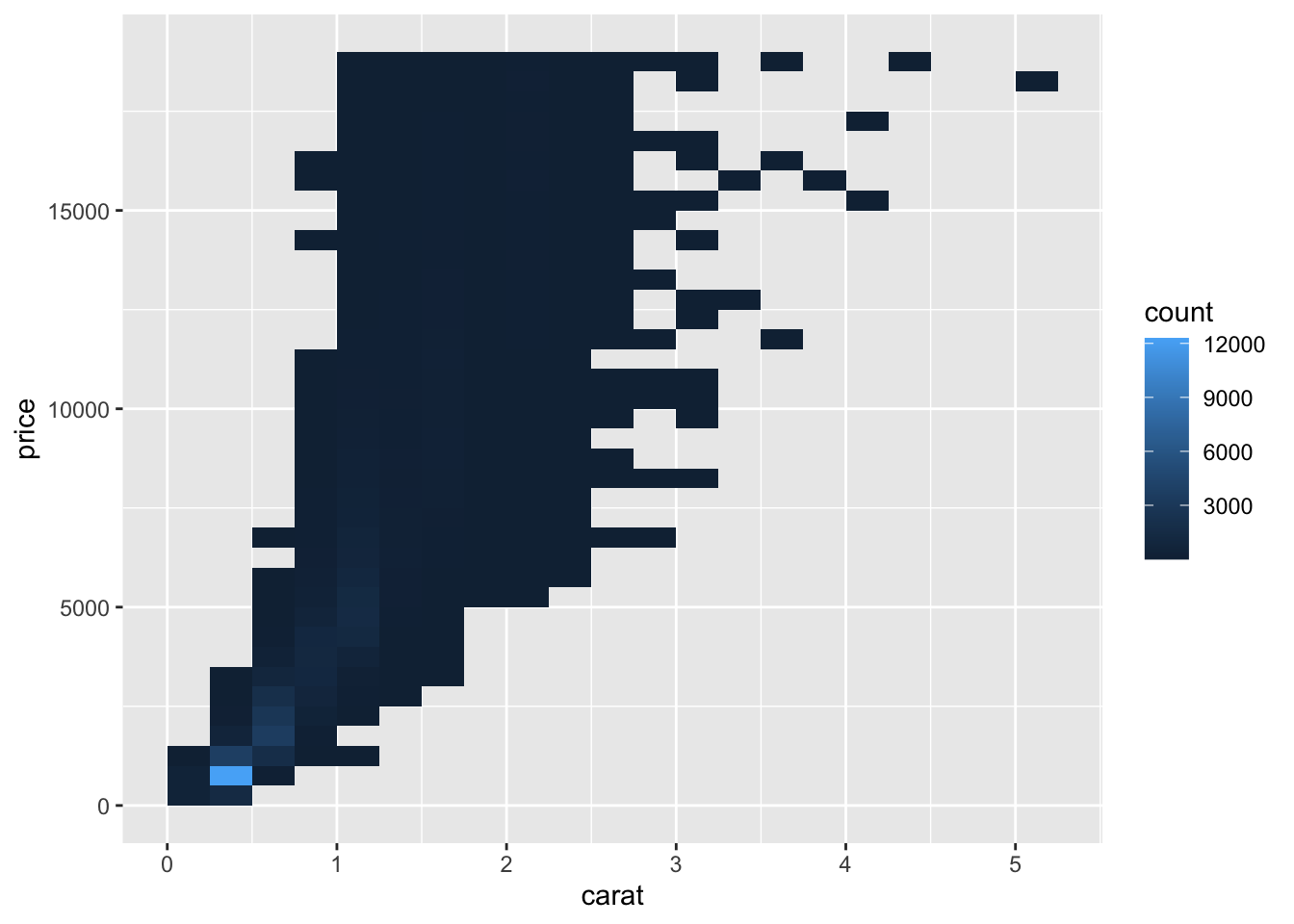
h + geom_density_2d()
h + geom_hex()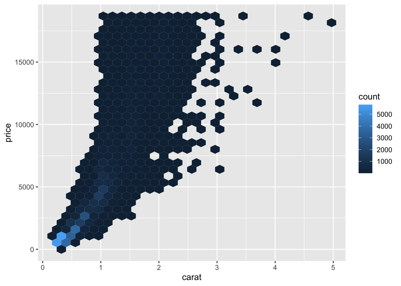
i <- ggplot(economics, aes(date, unemploy))
i + geom_area()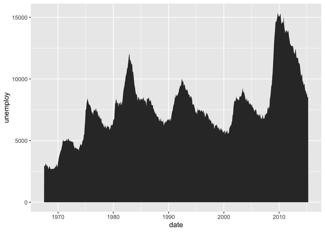
i + geom_line()
i + geom_step(direction = "hv")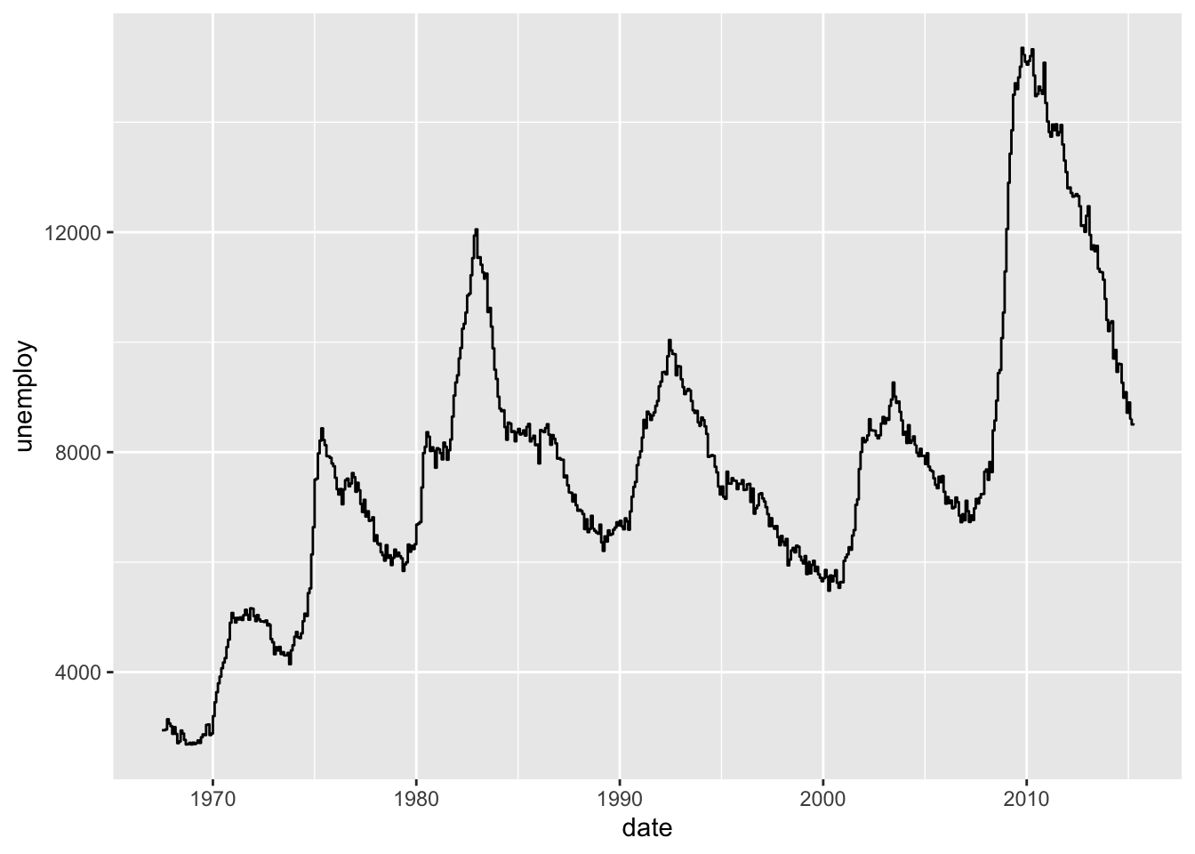
df <- data.frame(grp = c("A", "B"), fit = 4:5, se = 1:2)
j <- ggplot(df, aes(grp, fit, ymin = fit - se, ymax = fit + se))
j + geom_crossbar(fatten = 2)
j + geom_errorbar()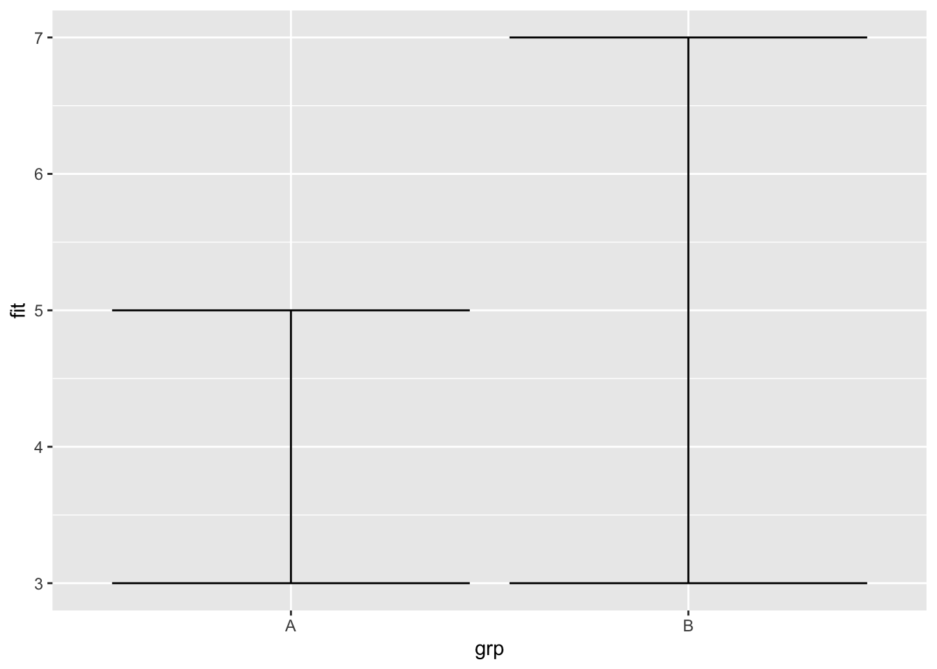
j + geom_linerange()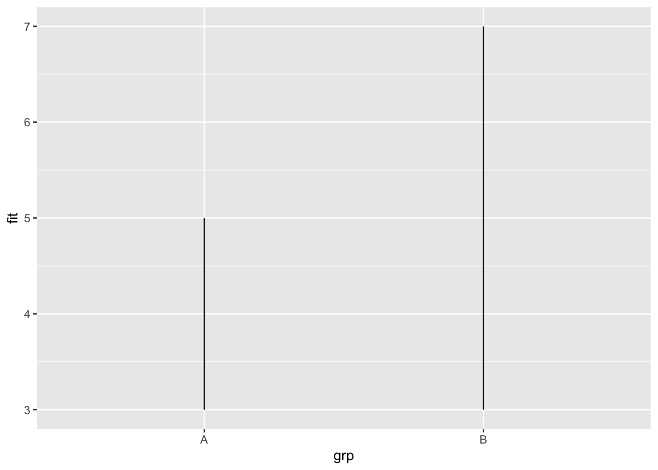
j + geom_pointrange()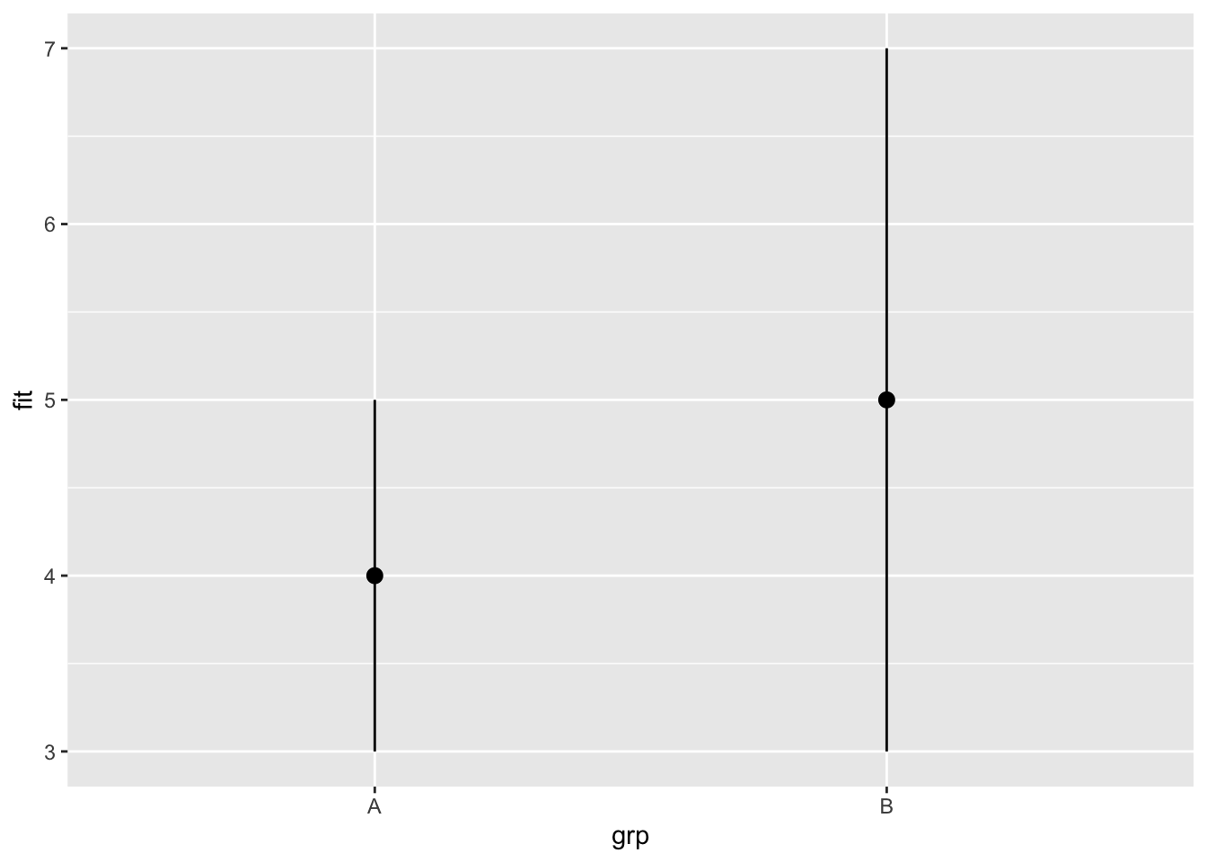
Previously, I showed how to use the map_data() function to make maps. But I found out that, according to Chapter 6 of the third edition of the ggplot2 book (available free at https://ggplot2-book.org/), the map_data() function isn’t currently maintained. That chapter recommends the use of a method of saving geographic data called simple features and packaged as the sf package. Here is a map made using that package and the USAboundaries package, which contains a wealth of geographic information about the USA.
pacman::p_load(USAboundaries)
pacman::p_load(sf)
pacman::p_load(tidyverse)
load(paste0(Sys.getenv("STATS_DATA_DIR"),"/vehiclesTiny.Rdata"))
dfMeanPrice <- dfTiny |> group_by(state) |>
  dplyr::summarize(meanprice=mean(price,na.rm=TRUE))
dfMeanPrice <- dfMeanPrice |> mutate(stusps=toupper(state))
statesContemporary <- us_states(states=c("Alabama", "Arizona", "Arkansas", "California", "Colorado", "Connecticut", "Delaware", "Florida", "Georgia", "Idaho", "Illinois", "Indiana", "Iowa", "Kansas", "Kentucky", "Louisiana", "Maine", "Maryland", "Massachusetts", "Michigan", "Minnesota", "Mississippi", "Missouri", "Montana", "Nebraska", "Nevada", "New Hampshire", "New Jersey", "New Mexico", "New York", "North Carolina", "North Dakota", "Ohio", "Oklahoma", "Oregon", "Pennsylvania", "Rhode Island", "South Carolina", "South Dakota", "Tennessee", "Texas", "Utah", "Vermont", "Virginia", "Washington", "West Virginia", "Wisconsin", "Wyoming"))
dfStateMeanPrice <- merge(statesContemporary,dfMeanPrice,by="stusps")
ggplot(dfStateMeanPrice) + geom_sf(data=dfStateMeanPrice,mapping=aes(fill=meanprice)) + coord_sf() + geom_sf_text(aes(label=stusps),color="white")
Warning in st_point_on_surface.sfc(sf::st_zm(x)): st_point_on_surface may not
give correct results for longitude/latitude data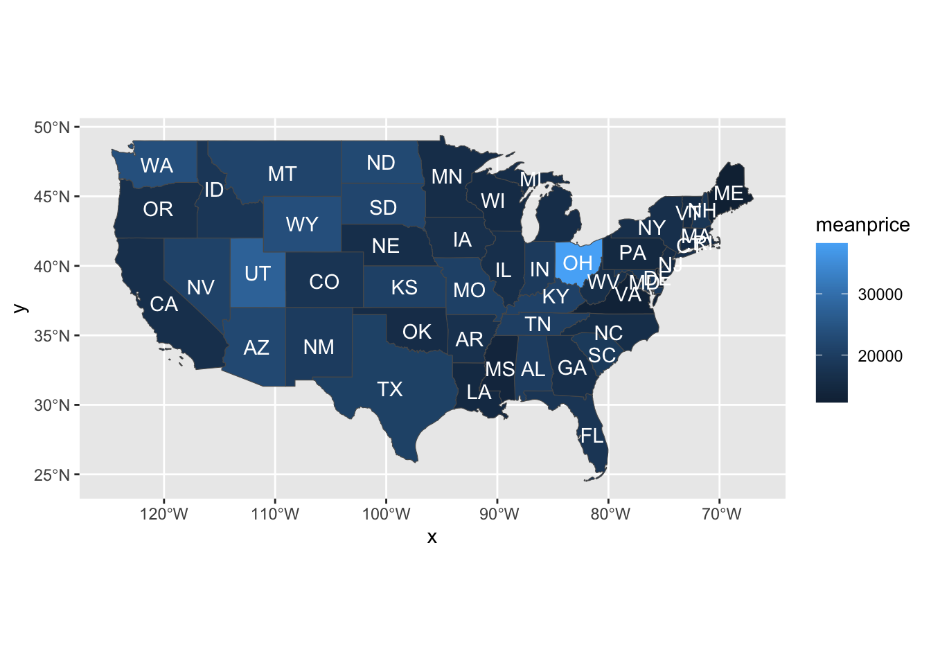
It probably seems inconvenient to have to name all the states. The only reason I did that was that, if I didn’t, the resulting map included some US territories in the Pacific Ocean, greatly reducing the size of the continental USA in the map. I couldn’t find a way to omit them except by just manually listing all the states in the continental US.
pacman::p_load(tidyverse)
df <- read_csv(paste0(Sys.getenv("STATS_DATA_DIR"),"/vehicles.csv"))
df$cylinders <- as_factor(df$cylinders)
df <- df[df$price<500000&df$price>500,]
df<-df[df$cylinders=="10 cylinders"|df$cylinders=="12 cylinders",]
df$price<-as.numeric(df$price)
options(scipen=999)
df |> ggplot(aes(price,cylinders))+geom_boxplot()
Warning: Removed 156391 rows containing non-finite values (`stat_boxplot()`).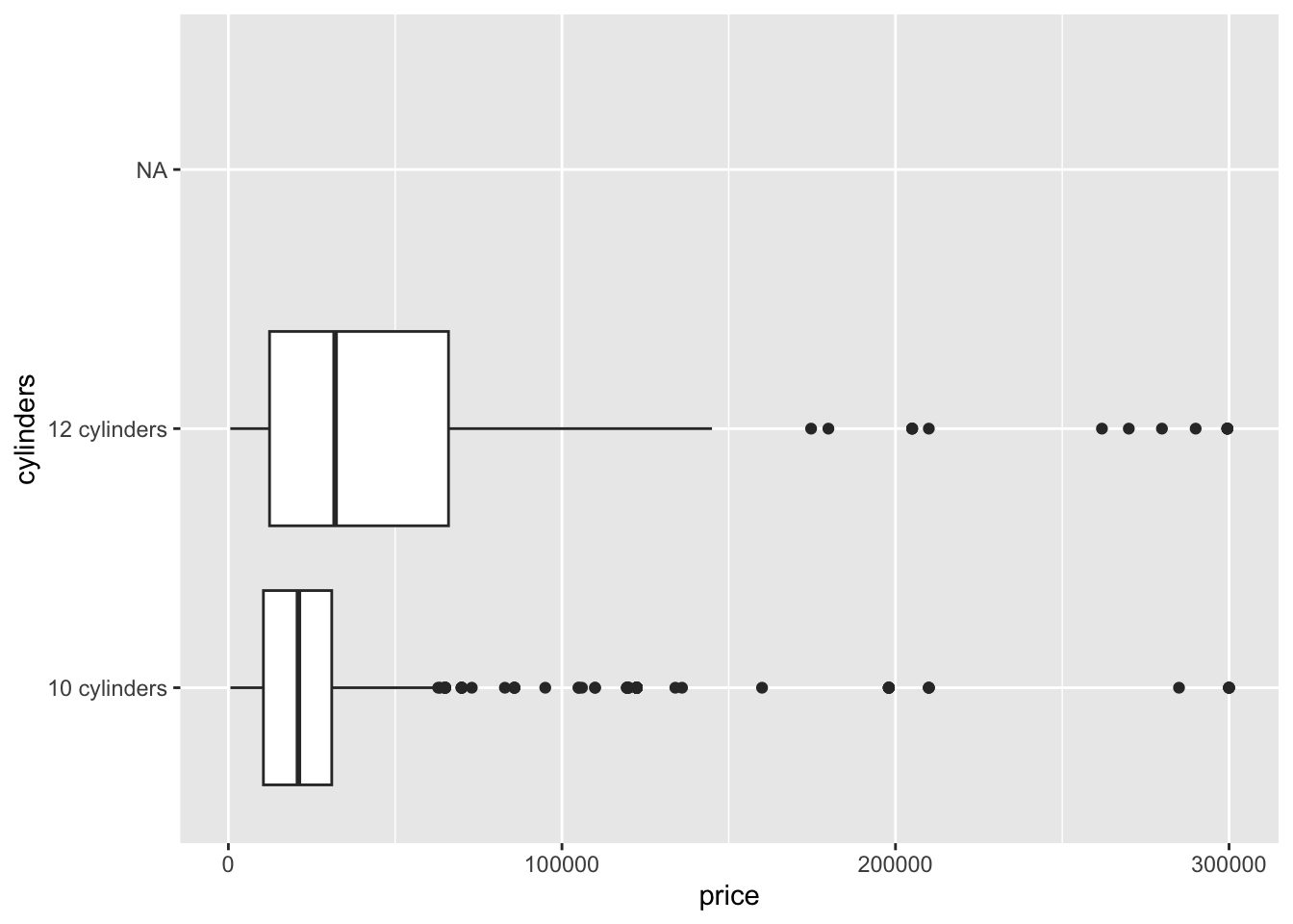
dfa <- df |> count(condition,cylinders)
pacman::p_load(treemap)
palette.HCL.options <- list(hue_start=270, hue_end=360+150)
treemap(dfa,
  index=c("condition","cylinders"),
  vSize="n",
  type="index",
  palette="Reds"
)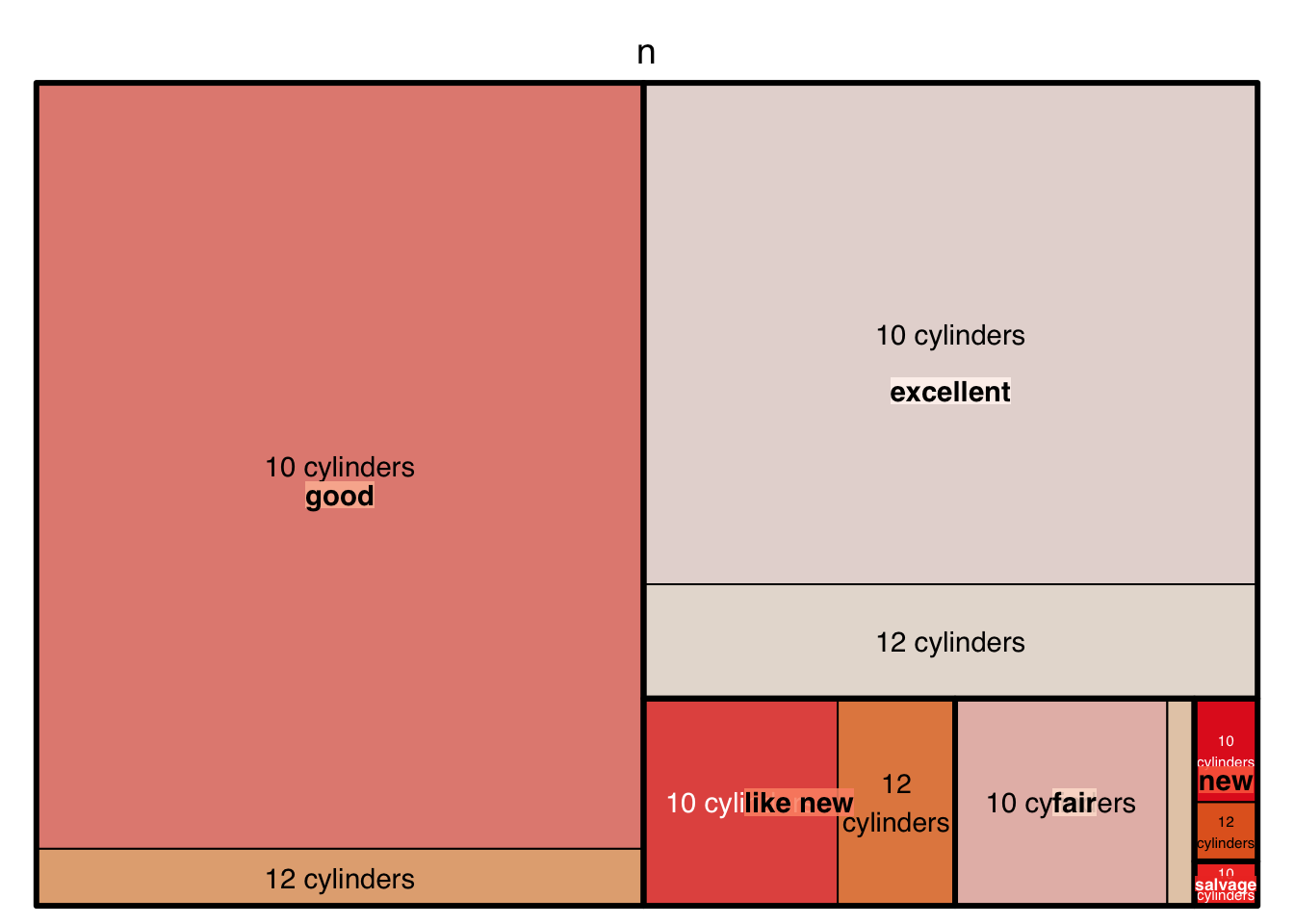
The palette in this case is selected from RColorbrewer. You can find the full set of RColorbrewer palettes at the R Graph Gallery.
The following scatterplot is completed in stages in section 2.2 of R4DS, which is available on Canvas as Wickham2023.pdf or online by googling r4ds 2e.
pacman::p_load(palmerpenguins)
pacman::p_load(ggthemes)
ggplot(
  data = penguins,
  mapping = aes(x = flipper_length_mm, y = body_mass_g)
) +
  geom_point(aes(color = species, shape = species)) +
  geom_smooth(method = "lm") +
  labs(
    title = "Body mass and flipper length",
    subtitle = "Dimensions for Adelie, Chinstrap, and Gentoo Penguins",
    x = "Flipper length (mm)", y = "Body mass (g)",
    color = "Species", shape = "Species"
  ) +
  scale_color_colorblind()
Warning: Removed 2 rows containing non-finite values (`stat_smooth()`).Warning: Removed 2 rows containing missing values (`geom_point()`).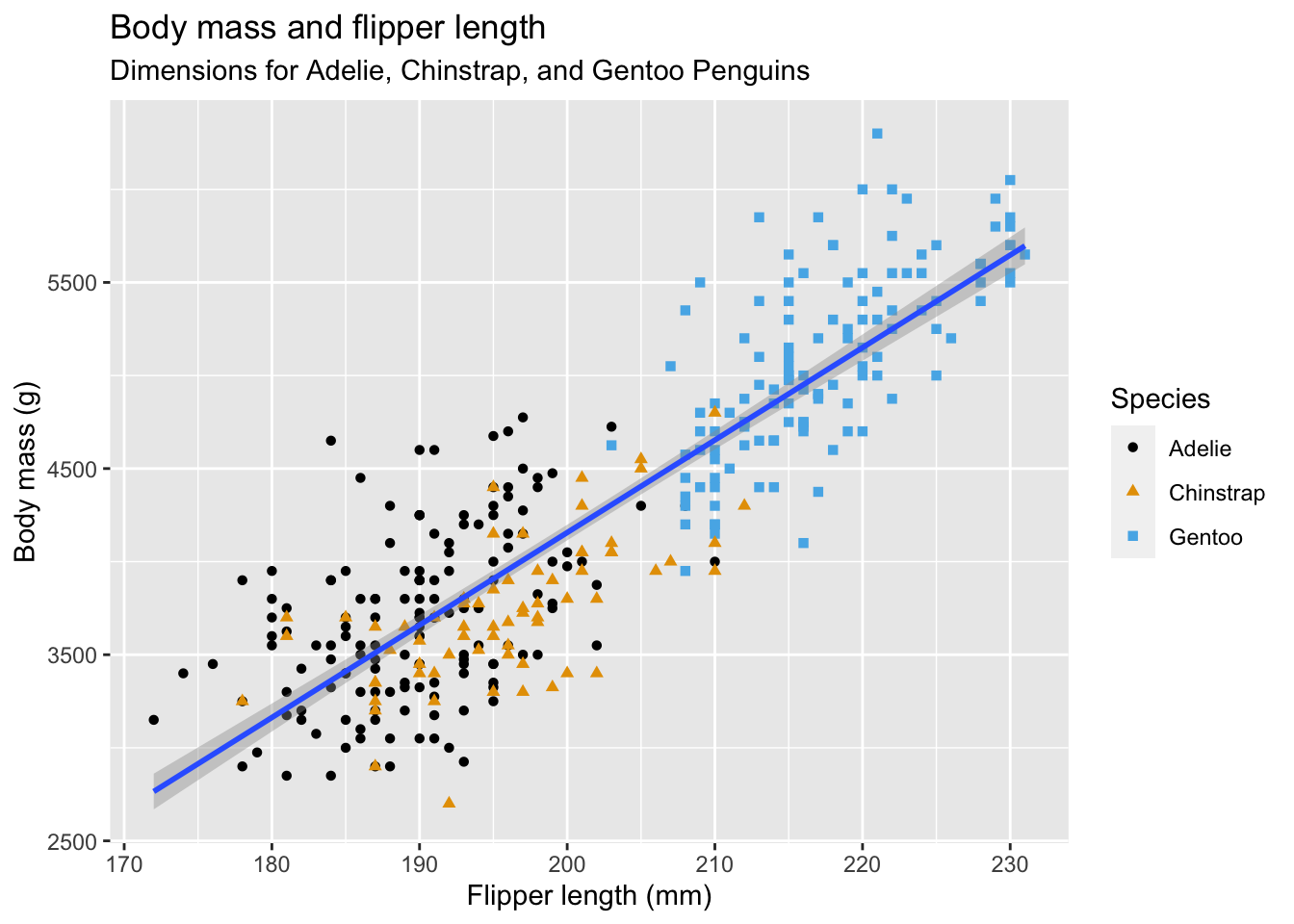
The following material comes from Mick McQuaid’s study guide for a previous course. In that course, we used Mendenhall and Sincich (2012) as a textbook, so there are innumerable references to that textbook in the following material. You don’t actually need that textbook and I will eventually delete references to it from this file. I just don’t have time right now.
This picture illustrates the normal distribution. The mound-shaped curve represents the probability density function and the area between the curve and the horizontal line represents the value of the cumulative distribution function.
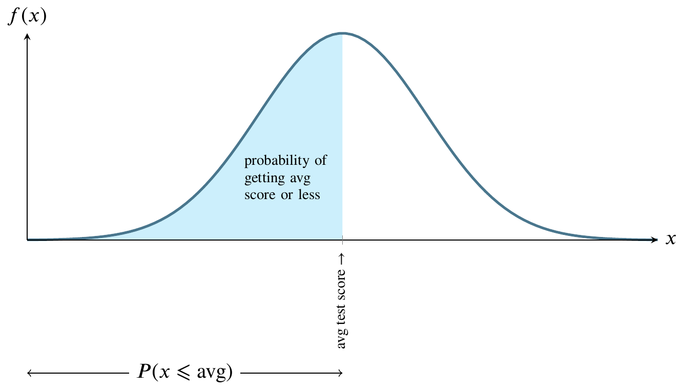
Consider a normally distributed nationwide test.
The total shaded area between the curve and the straight horizontal line can be thought of as one hundred percent of that area. In the world of probability, we measure that area as 1. The curve is symmetrical, so measure all the area to the left of the highest point on the curve as 0.5. That is half, or fifty percent, of the total area between the curve and the horizontal line at the bottom. Instead of saying area between the curve and the horizontal line at the bottom, people usually say the area under the curve.
For any value along the \(x\)-axis, the \(y\)-value on the curve represents the value of the probability density function.
The area bounded by the vertical line between the \(x\)-axis and the corresponding \(y\)-value on the curve, though, is what we are usually interested in because that area represents probability.
Here is a graph of the size of that area. It’s called the cumulative distribution function.
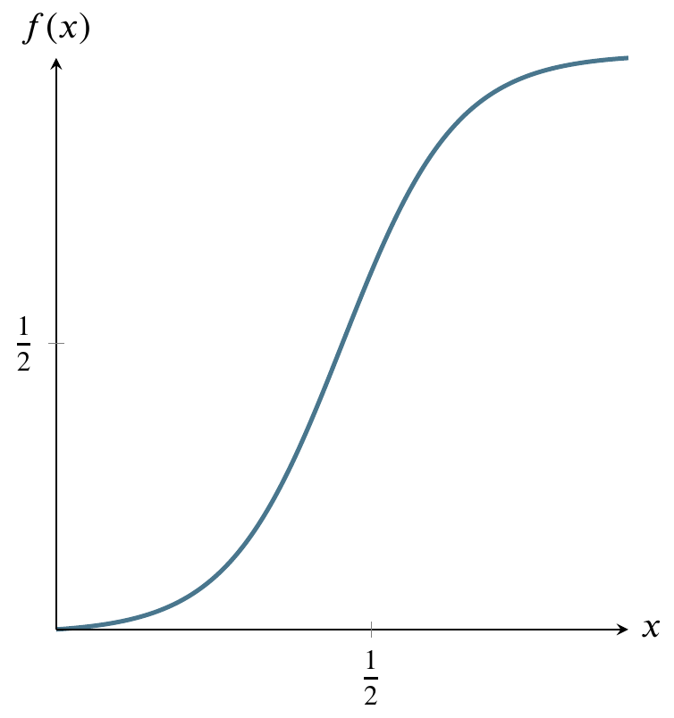
The above graph can be read as having an input and output that correspond to the previous graph of the probability density function. As we move from right to left on the \(x\)-axis, the area that would be to the left of a given point on the probability density function is the \(y\)-value on this graph. For example, if we go half way across the \(x\)-axis of the probability density function, the area to its left is one half of the total area, so the \(y\)-value on the cumulative distribution function graph is one half.
The shape of the cumulative distribution function is called a sigmoid curve. You can see how it gets this shape by looking again at the probability density function graph above. As you move from left to right on that graph, the area under the curve increases very slowly, then more rapidly, then slowly again. The places where the area grows more rapidly and then more slowly on the probability density function curve correspond to the s-shaped bends on the cumulative distribution curve.
At the left side of the cumulative distribution curve, the \(y\)-value is zero meaning zero probability. When we reach the right side of the cumulative distribution curve, the \(y\)-value is 1 or 100 percent of the probability.
Let’s get back to the example of a nationwide test. If we say that students nationwide took an test that had a mean score of 75 and that the score was normally distributed, we’re saying that the value on the \(x\)-axis in the center of the curve is 75. Moreover, we’re saying that the area to the left of 75 is one half of the total area. We’re saying that the probability of a score less than 75 is 0.5 or fifty percent. We’re saying that half the students got a score below 75 and half got a score above 75.
That is called the frequentist interpretation of probability. In general, that interpretation says that a probability of 0.5 is properly measured by saying that, if we could repeat the event enough times, we would find the event happening half of those times.
Furthermore, the frequentist interpretation of the normal distribution is that, if we could collect enough data, such as administering the above test to thousands of students, we would see that the graph of the frequency of their scores would look more and more like the bell curve in the picture, where \(x\) is a test score and \(y\) is the number of students receiving that score.
Suppose we have the same test and the same distribution but that the mean score is 60. Then 60 is in the middle and half the students are on each side. That is easy to measure. But what if, in either case, we would like to know the probability associated with scores that are not at that convenient midpoint?
It’s hard to measure any other area under the normal curve except for \(x\)-values in the middle of the curve, corresponding to one half of the area. Why is this?
To see why it’s hard to measure the area corresponding to any value except the middle value, let’s first consider a different probability distribution, the uniform distribution. Suppose I have a machine that can generate any number between 0 and 1 at random. Further, suppose that any such number is just as likely as any other such number.
Here’s a graph of the the uniform distribution of numbers generated by the machine. The horizontal line is the probability density function and the shaded area is the cumulative distribution function from 0 to 1/2. In other words, the probability of the machine generating numbers from 0 to 1/2 is 1/2. The probability of generating numbers from 0 to 1 is 1, the area of the entire rectangle.

It’s very easy to calculate any probability for this distribution, in contrast to the normal distribution. The reason it is easy is that you can just use the formula for the area of a rectangle, where area is base times side. The probability of being in the entire rectangle is \(1\times1=1\), and the probability of being in the part from \(x=0\) to \(x=1/4\) is just \(1\times(1/4)=1/4\).
The cumulative distribution function of the uniform distribution is simpler than that of the normal distribution because area is being added at the same rate as we move from left to right on the above graph. Therefore it is just a straight diagonal line from (0,1) on the left to (1,1) on the right.
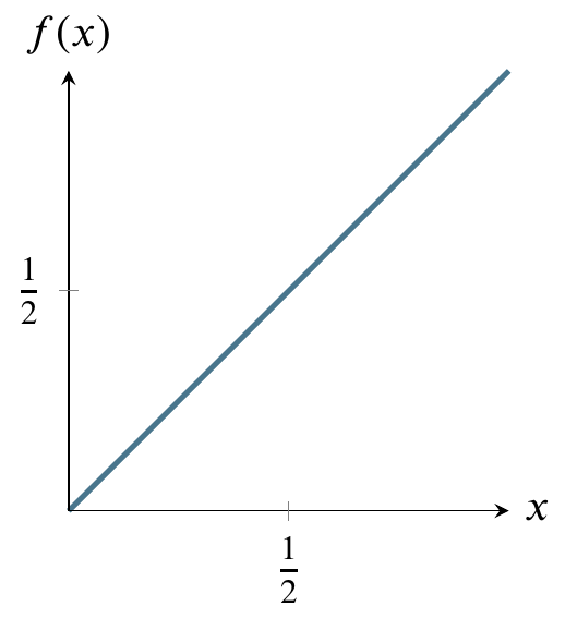
Reading it is the same as reading the cumulative distribution function for the normal distribution. For any value on the \(x\)-axis, say, 1/2, go up to the diagonal line and over to the value on the \(y\)-axis. In this case, that value is 1/2. That is the area under the horizontal line in the probability density function graph from 0 to 1/2 (the shaded area). For a rectangle, calculating area is trivial.
Calculating the area of a curved region, like the normal distribution, though, can be more difficult. If you’ve studied any calculus, you know that there are techniques for calculating the area under a curve. These techniques are called integration techniques. In the case of the normal distribution the formula for the height of the curve at any point on the \(x\)-axis is \[\begin{equation*} \frac{1}{\sigma\sqrt{2\pi}}e^{-(x-\mu)^2/2\sigma^2} \end{equation*}\] and the area is the integral of that quantity from \(-\infty\) to \(x\), which can be rewritten as \[\begin{equation*} \frac{1}{\sqrt{2\pi}}\int^x_{-\infty}e^{-t^2/2}dt =(1/2)\left(1+\text{erf}\left(\frac{x-\mu}{\sigma\sqrt{2}}\right)\right) \end{equation*}\] The integral on the left is difficult to evaluate so people use numerical approximation techniques to find the expression on the right in the above equation. Those techniques are so time-consuming that, rather than recompute them every time they are needed, a very few people used to write the results into a table and publish it and most people working with probability would just consult the tables. Only in the past few decades have calculators become available that can do the tedious approximations. Hence, most statistics books, written by people who were educated decades ago, still teach you how to use such tables. There is some debate as to whether there is educational value in using the tables vs using calculators or smartphone apps or web-based tables or apps. We’ll demonstrate them and assume that you use a calculator or smartphone app on exams.
Since there is no convenient integration formula, people used tables until recently. Currently you can google tables or apps that do the work of tables. We’re going to do two exercises with tables that help give you an idea of what’s going on. You can use your calculator afterward. The main reason for what follows is so you understand the results produced by your calculator to avoid ridiculous mistakes.
\[z=\frac{y-\mu}{\sigma}\]
Calculations use the fact that the bell curve is symmetric and adds up to 1, so you can calculate one side and add it, subtract it, or double it
Following are four examples.
\(P(-1 \leqslant z \leqslant 1)\): Since the bell curve is symmetric, find the area from \(z=0\) to \(z=1\) and double that area. The table entry for \(z=1\) gives the relevant area under the curve, .3413. Doubling this gives the area from -1 to 1: .6826. Using a calculator may give you .6827 since a more accurate value than that provided by the table would be .6826895. This is an example where no points would be deducted from your score for using either answer.
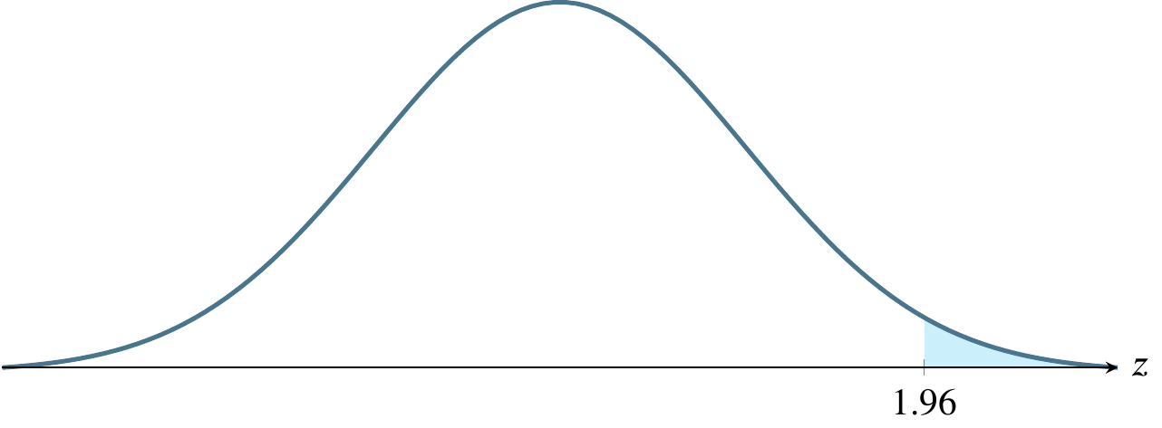
\(P(-1.96 \leqslant z \leqslant 1.96)\): This is one of the three most common areas of interest in this course, the other two being the one in part (c) below and the one I will add on after I show part (d) below. Here again, we can read the value from the table as .4750 and double it, giving .95. This is really common because because 95% is the most commonly used confidence interval.
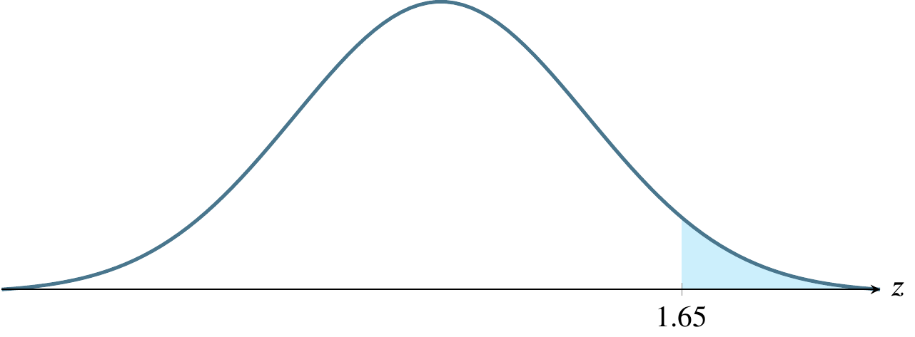
\(P(-1.645 \leqslant z \leqslant 1.645)\): The table does not have an entry for this extremely commonly desired value. A statistical calculator or software package will show that the result is .45, which can be doubled to give .90, another of the three most frequently used confidence intervals. If you use interpolation, you will get the correct answer in this case. Interpolation means to take the average of the two closest values, in this case \((.4495+ .4505) / 2\). You will rarely, if ever need to use interpolation in real life because software has made the tables obsolete and we only use them to try to drive home the concept of \(z\)-scores relating to area under the curve, rather than risking the possibility that you learn to punch numbers into an app without understanding them. Our hope is that, by first learning this method, you will be quick to recognize the results of mistakes, rather than naively reporting wacky results like the probability is 1.5 just because you typed a wrong number.
\(P(-3 \leqslant z \leqslant 3)\): The table gives .4987 and doubling that gives .9974. A calculator would give the more correct (but equally acceptable in this course) result of .9973.
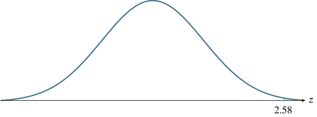
The other common confidence interval I mentioned above is the 99% confidence interval, used in cases where the calculation relates to something life-threatening, such as a question involving a potentially life-saving drug or surgery. A table or calculator will show that the \(z\)-score that would lead to this result is 2.576. So if you were asked to compute \(P(-2.576 \leqslant z \leqslant 2.576)\), the correct answer would be .99 or 99%. To use a calculator or statistical app to find the \(z\)-score given the desired probability, you would look in an app for something called a quantile function.
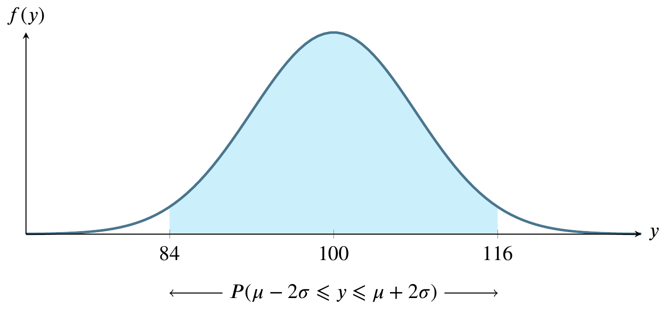
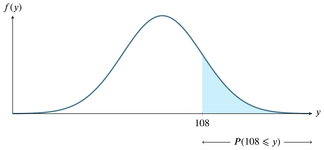
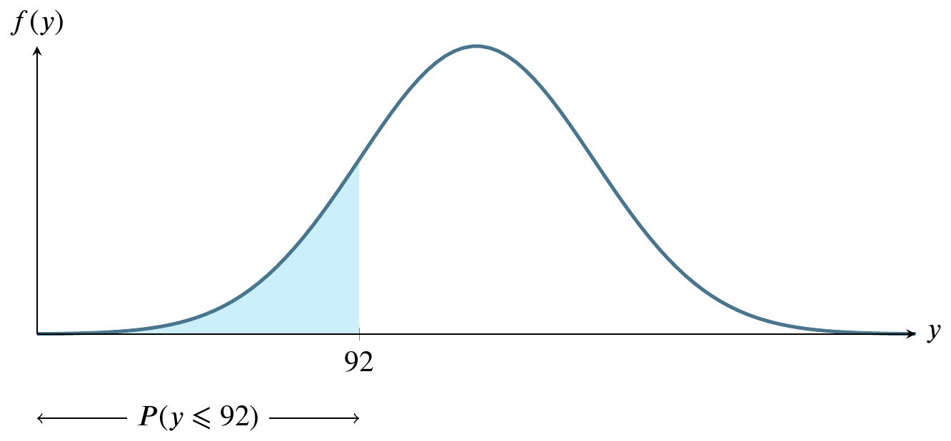
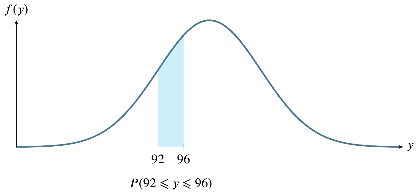
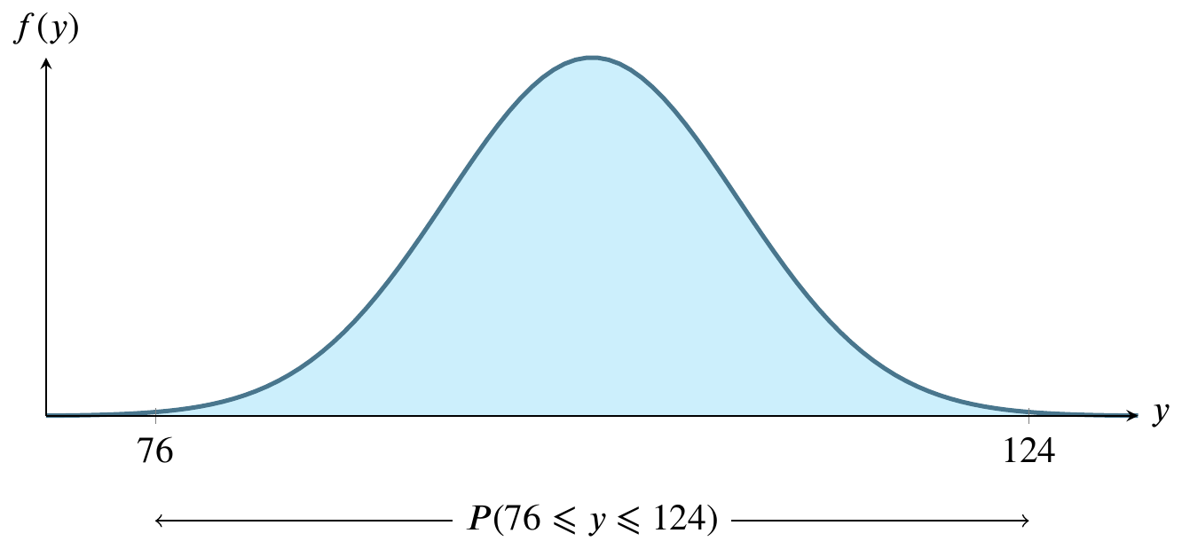
Sketch the normal curve six times, identifying a different region on it each time. For these graphs, let \(y\sim N(100,8)\).

For large sample sizes, the sample mean \(\overline{y}\) from a population with mean \(\mu\) and standard deviation \(\sigma\) has a sampling distribution that is approximately normal, regardless of the probability distribution of the sampled population.
In business, distributions of phenomena like waiting times and customer choices from a catalog are typically not normally distributed, but instead long-tailed. The central limit theorem means that resampling the mean of any of these distributions can be done on a large scale using the normal distribution assumptions without regard to the underlying distribution. This simplifies many real-life calculations. For instance, waiting times at each bus stop are exponentially distributed but if we take the mean waiting time at each of 100 bus stops, the mean of those 100 times is normally distributed, even though the individual waiting times are drawn from an exponential distribution.
Let \(p\) be the parameter of interest, in this case a proportion. (This not the same thing as a \(p\)-value, which we will explore later.) We don’t know \(p\) unless we examine every object in the population, which is usually impossible. For example, there are regulations in the USA requiring cardboard boxes used in interstate commerce to have a certain strength, which is measured by crushing the box. It would be economically unsound to crush all the boxes, so we crush a sample and obtain an estimate \(\hat{p}\) of \(p\). The estimate is pronounced p-hat.
The central limit theorem can be framed in terms of its mean and standard error:
\[ \mu_{\hat{p}}=p \qquad \text{SE}_{\hat{p}} = \sqrt{\frac{p(1-p)}{n}} \]
The conditions under which this holds true are
The sample observations are independent if they are drawn from a random sample. Sometimes you have to use your best judgment to determine whether the sample is truly random. For example, friends are known to influence each other’s opinions about pop music, so a sample of their opinions of a given pop star may not be random. On the other hand, their opinions of a previously unheard song from a previously unheard artist may have a better chance of being random.
These conditions matter when conducting activities like constructing a confidence interval or modeling a point estimate.
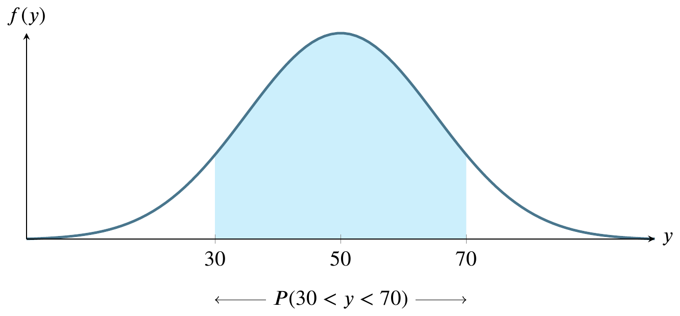
Consider an example for calculating a \(z\)-score where \(x\sim N(50,15)\), which is a statistical notation for saying \(x\) is a random normal variable with mean 50 and standard deviation 15. It is also read as if you said that \(x\) has the normal distribution with mean 50 and standard deviation 15.
In order to identify the size of the shaded area, we can use the table of \(z\)-scores by standardizing the parameters we believe to apply, as if they were the population parameters \(\mu\) and \(\sigma\). We only do this if we have such a large sample that we have reason to believe that the sample values approach the population parameters. For the much, much more typical case where we have a limited amount of data, we’ll learn a more advanced technique that you will use much more frequently in practice.
The table in our textbook contains an input in the left and top margins and an output in the body. The input is a \(z\)-score, the result of the calculation \[z=\frac{y-\mu}{\sigma}\] where \(z\geq 0\). The output is a number in the body of the table, expressing the probability for the area between the normal curve and the axis, from the mean (0) to \(z\). Note that the values of \(z\) start at the mean and grow toward the right end of the graph. If \(z\) were \(\infty\), the shaded area would be 0.5, also known as 50 percent.
For now, let’s calculate the \(z\)-score as \[z=\frac{y-\mu}{\sigma}=\frac{70-50}{15}=1.33\] giving half of the answer we’re seeking:
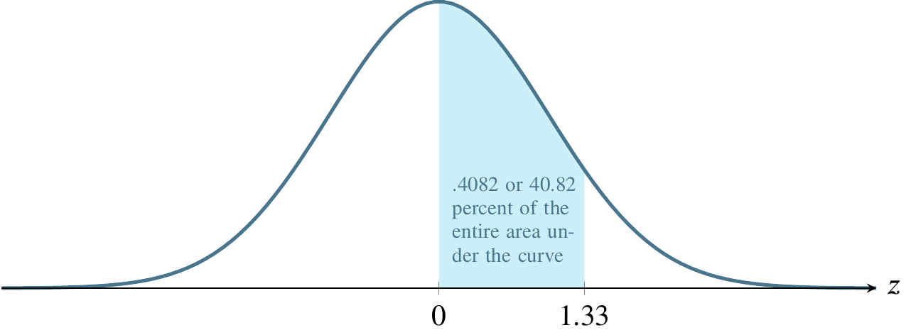
Now use this to read the table. The input is 1.33 and you’ll use the left and top margins to find it. The output is the corresponding entry in the body of the table, .4082, also known as 40.82 percent of the area under the curve.
Recall that our initial problem was to find \(P(30<y<70)\) and what we’ve just found, .4082, is \(P(50<y<70)\). We must multiply this result by 2 to obtain the correct answer, .8164 or 81.64 percent. That is to say that the probability that \(y\) is somewhere between 30 and 70 is .8164 or 81.64 percent. As a reality check, all probabilities for any single event must sum to 1, and the total area under the curve is 1, so it is a relief to note that the answer we’ve found is less than 1. It’s also comforting to note that the shaded area in the original picture of the example looks like it could plausibly represent about 80 percent of the total area. It is easy to get lost in the mechanics of calculations and come up with a wildly incorrect answer because of a simple arithmetic error.
Bear in mind that anyone can publish a \(z\)-score table using their own customs. Students have found such tables that define \(z\) as starting at the extreme left of the curve. If we used such a table for the above example, the output would have been .9082 instead of .4082 and we would have had to subtract the left side, .5, from that result before multiplying by 2.
Many exam-style problems will ask questions such that you must do more or less arithmetic with the result from the table. Consider these questions, still using the above example where \(y\sim N(50,15)\):
Each of these questions can be answered using \(z=1.33\) except the first. Since we know that \(y\) is normally distributed, we also know that the probability of \(y\) being greater than its mean is one half, so the answer to the first question is 0.5 or fifty percent. The second question simply requires us to subtract the result from the table, .4082, from .5 to find the area to the right of 1.33, which is .0918 or 9.18 percent. The third question is symmetrical with the second, so we can just use the method from the second question to find that it is also .0918. Similarly, the fourth question is symmetrical with the first step from the book example, so the answer is the answer to that first step, .4082.
What is the probability that \(y\) is between 30 and 40?

Subtract the probability that \(y\) is between 50 and 60 from the probability that \(y\) is between 50 and 70.

Let’s look at these steps with an example. Suppose that \(y\sim N(50,8)\). In words, this means that \(y\) has the normal distribution with true mean 50 and true standard deviation 8. Let’s answer the question What’s the probability that \(y>40\)?
Step 1 is to draw a picture to make sense of the question. The picture shows the area under the curve where the scale marking is to the right of 40. This picture tells you right away that the number that will answer the question is less than 1 (the entire curve would be shaded if it were 1) and more than 1/2 (the portion to the right of 50 would be 1/2 and we have certainly shaded more than that).
Step 2 is to standardize the question so we can use a table or app to find the probability / area. We use the equation \(z=(y-\mu)/\sigma\) with values from the original question: \((50-40)/8=-10/8=-1.25\). Now we know the labels that would go on a standardized picture similar to the picture above. Now we can ask the standardized question What’s the probability that \(z>-1.25\)?
Step 3 is to draw that standardized picture. It’s the same as the picture above except standardized so that it fits the tables / apps for calculating probability / area. Now, instead of \(y\) we’re looking for \(z\) and the probability associated with \(z\) on a standardized table will be the same as for \(y\) on a table for the parameters given in the original question.
Step 4 is to pick one of the three kinds of tables / apps to input the standardized \(z\) score to get a probability as output. In this example, we only have to do this step once because we only want to know the area greater than \(y\). If we wanted to know a range between two \(y\) values, we’d need the \(z\) scores for each of them so we’d have to do it twice.
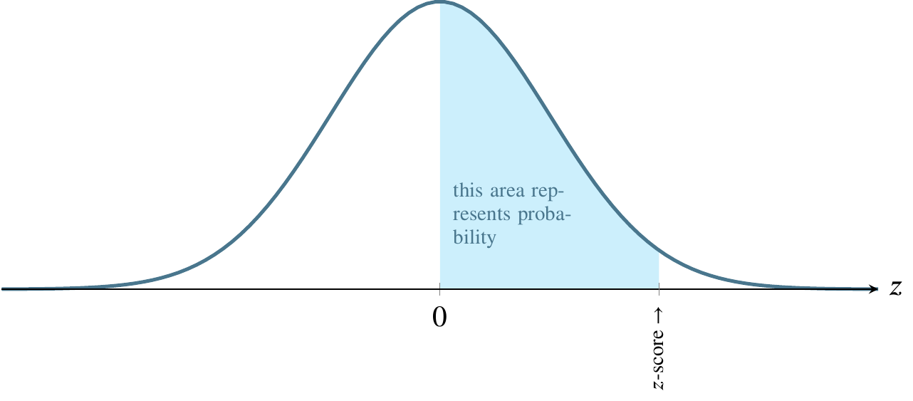
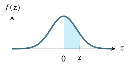
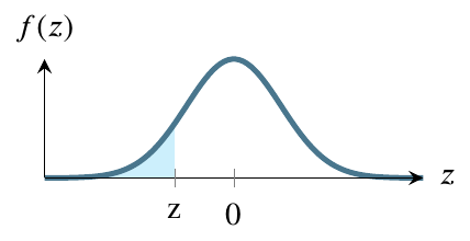
The three kinds of output from tables / apps are as follows.

The first figure shows how the table works in some books. It provides the value from 0 to \(|z|\). If \(z\) is negative, using this table requires you to input \(|z|\) instead. In this question, the value you get will be .3944. To get the ultimate answer to this question, Step 5 will be to add this value to .5, giving a final answer of .8944.
The second figure shows how most tables and apps work. It gives the value from \(-\infty\) to \(z\). In this question, the value you get will be .1056. To get the ultimate answer to this question, Step 5 will be to subtract this value from 1, giving a final answer of .8944.
The bottom figure shows how some tables and apps work. It gives the value from z to \(+\infty\). In this question, the value you get will be .8944. To get the ultimate answer to this question, Step 5 will be to simply report this value, giving a final answer of .8944.
Notice that all three types of tables / apps lead to the same result by different paths. In this case, the right figure is the most convenient but, for other questions, one of the others may be more convenient.
Step 5, the final step is to use the value you got from a table or app in conjunction with the original picture you drew in Step 1. Since the procedure for step 5 depends on the table / app you use, I gave the procedure for Step 5 above in the paragraphs for top, middle, and bottom figure.
A large-sample \(100(1-\alpha)\%\) confidence interval for a population mean, \(\mu\), is given by
\[\mu \pm z_{\alpha/2} \sigma_y \approx \overline{y}\pm z_{\alpha/2} \frac{s}{\sqrt{n}}\]
Example exam question: ten samples of gas mileage have been calculated for a new model of car by driving ten examples of the car each for a week. The average of the ten samples is 17. The sum of the squares of the sample is 3281. What is their standard deviation?
The information in the problem statement hints that you should use \[s=\sqrt{\frac{\sum_{i=1}^n y_i^2 - n(\overline{y})^2}{n-1}}\] so you write \[s=\sqrt{\frac{3281 - 10(17)^2}{10-1}}=\sqrt{\frac{3281-2890}{9}}=\sqrt{43.4444}=6.5912\]
The sample of ten gas mileage estimates is 17, 18, 16, 20, 14, 17, 21, 13, 22, 12, 17. The sum of their squares is inevitably larger than or equal to the mean squared times the number of values. The easiest way to see this is to use a series of identical values. Hence, finding the sum of the squares is the same as calculating the mean squared times the number of values. There is no variance at all in such a sample, so it makes sense to arrive at a standard deviation of zero. Is there any way to alter such a sample so that the sum of the squared values falls below the mean? No.
The previous example was developed as an answer to the question, what do I do if I need to do a negative square root? You can figure out that you will never need to do so by the preceding process of finding a way to make \(\sum y_i^2 = n(\overline{y}^2)\) and then trying to alter the values to decrease the left side or increase the right side.
Table 4.6 from James et al. (2021) shows the possible results of classification.
| True class | ||||
|---|---|---|---|---|
| \(-\) or Null | \(+\) or Non-null | Total | ||
| Predicted class | \(-\) or Null | True Negative (TN) | False Negative (FN) | N\(*\) |
| \(+\) or Non-null | False Positive (FP) | True Positive (TP) | P\(*\) | |
| Total | N | P | ||
Table 4.7 from James et al. (2021) gives some synonyms for important measures of correctness and error in various disciplines.
| name | definition | synonyms |
|---|---|---|
| False Positive rate | FP/N | Type I error, 1 \(-\) Specificity |
| True Positive rate | TP/P | 1 \(-\) Type II error, power, sensitivity, recall |
| Positive Predictive value | TP/P\(*\) | Precision, 1 \(-\) false discovery proportion |
| Negative Predictive value | TN/N\(*\) |
At the beginning of the course, I said that statistics describes data and makes inferences about data. This course is partly about the latter, making inferences. You can make two kinds of inferences about a population parameter: estimate it or test a hypothesis about it.
You may have a small sample or a large sample. The difference in the textbook is typically given as a cutoff of 30. Less is small, more is large. Other cutoffs are given, but this is the most prevalent.
Large samples with a normal distribution can be used to estimate a population mean using a \(z\)-score. Small samples can be used to estimate a population mean using a \(t\)-statistic.
If we take more and more samples from a given population, the variability of the samples will decrease. This relationship gives rise to the standard error of an estimate \[\sigma_{\overline{y}}=\frac{\sigma}{\sqrt{n}}\]
The standard error of the estimate is not exactly the standard deviation. It is the standard deviation divided by a function of the sample size and it shrinks as the sample size grows.
If the sample is larger than or equal to 30, use the formula for finding a large-sample confidence interval to estimate the mean.
A large-sample \(100(1-\alpha)\%\) confidence interval for a population mean, \(\mu\), is given by
\[\mu \pm z_{\alpha/2} \sigma_{\overline{y}} \approx \overline{y}\pm z_{\alpha/2} \frac{s}{\sqrt{n}}\]
If the sample is smaller than 30, calculate a \(t\)-statistic and use the formula for finding a small-sample confidence interval to estimate the mean.
The \(t\)-statistic you calculate from the small sample is \[ t=\frac{\overline{y}-\mu_0}{s/\sqrt{n}} \]
Does your calculated \(t\) fit within a \(100(1-\alpha)\%\) confidence interval? Find out by calculating that interval. A small-sample \(100(1-\alpha)\%\) confidence interval for a population mean, \(\mu\), is given by
\[\mu \pm t_{\alpha/2} s_{\overline{y}} \approx \overline{y}\pm t_{\alpha/2,\nu} \frac{s}{\sqrt{n}}\] Here, you are using a \(t\) statistic based on a chosen \(\alpha\) to compare to your calculated \(t\)-statistic. The Greek letter \(\nu\), pronounced nyoo, represents the number of degrees of freedom.
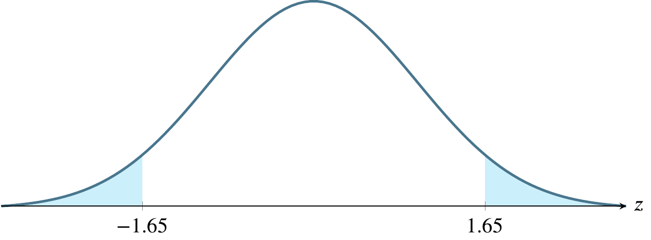
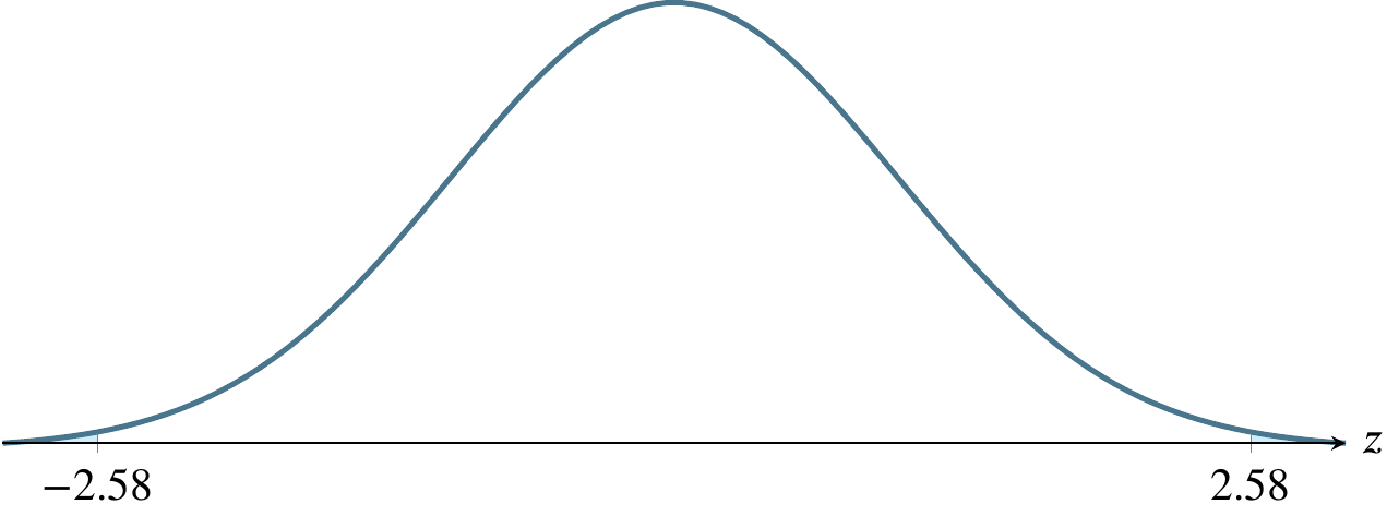
Estimating a mean involves finding a region where the mean is likely to be. The first question to ask is how likely? and to do so, we use a concept called alpha, denoted by the Greek letter \(\alpha\). Traditionally, people have used three values of \(\alpha\) for the past century, .10, .05, and .01. These correspond to regions of \(1-\alpha\) under the normal distribution curve, so these regions are 90 percent of the area, 95 percent of the area, and 99 percent of the area. What we are saying, for instance, if \(\alpha=0.01\) is that we are 99 percent confident that the true population mean lies within the region we’ve calculated, \(\overline{y}\pm 2.576\sigma_{\overline{y}}\)
Traditionally, \(\alpha=0.01\) is used in cases where life could be threatened by failure.
Traditionally, \(\alpha=0.05\) is used in cases where money is riding on the outcome.
Traditionally, \(\alpha=0.10\) is used in cases where the consequences of failing to capture the true mean are not severe.
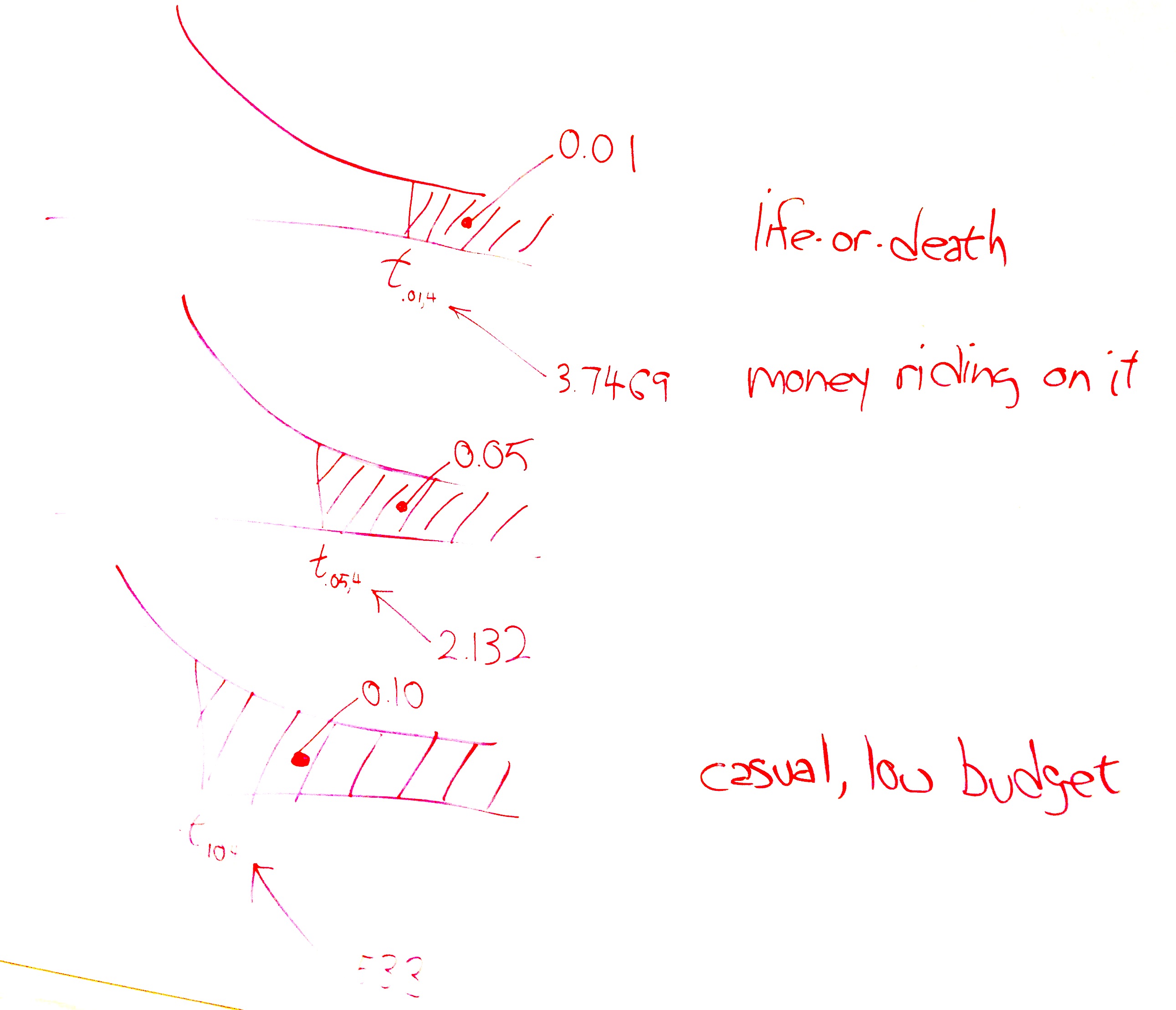
The above picture shows these three cases. The top version, life-or-death, has the smallest rejection region. Suppose the test is whether a radical cancer treatment gives longer life than a traditional cancer treatment. Let’s say that the traditional treatment gives an average of 15 months longer life. The null hypothesis is that the new treatment also gives 15 months longer life. The alternative hypothesis is that the radical treatment gives 22 months more life on average based on on only five patients who received the new treatment. A patient can only do one treatment or the other. The status quo would be to take the traditional treatment unless there is strong evidence that the radical treatment provides an average longer life. In the following picture, the shaded area is where the test statistic would have to fall for us to say that there is strong evidence that the radical treatment provides longer life. We want to make that shaded region as small as possible so we minimize the chance our test statistic lands in it by mistake.
We can afford to let that shaded area be bigger (increasing the chance of mistakenly landing in it) if only money, not life, is riding on the outcome. And we can afford to let it be bigger still if the consequences of the mistake are small. To choose an \(\alpha\) level, ask yourself how severe are the consequences of a Type I error.
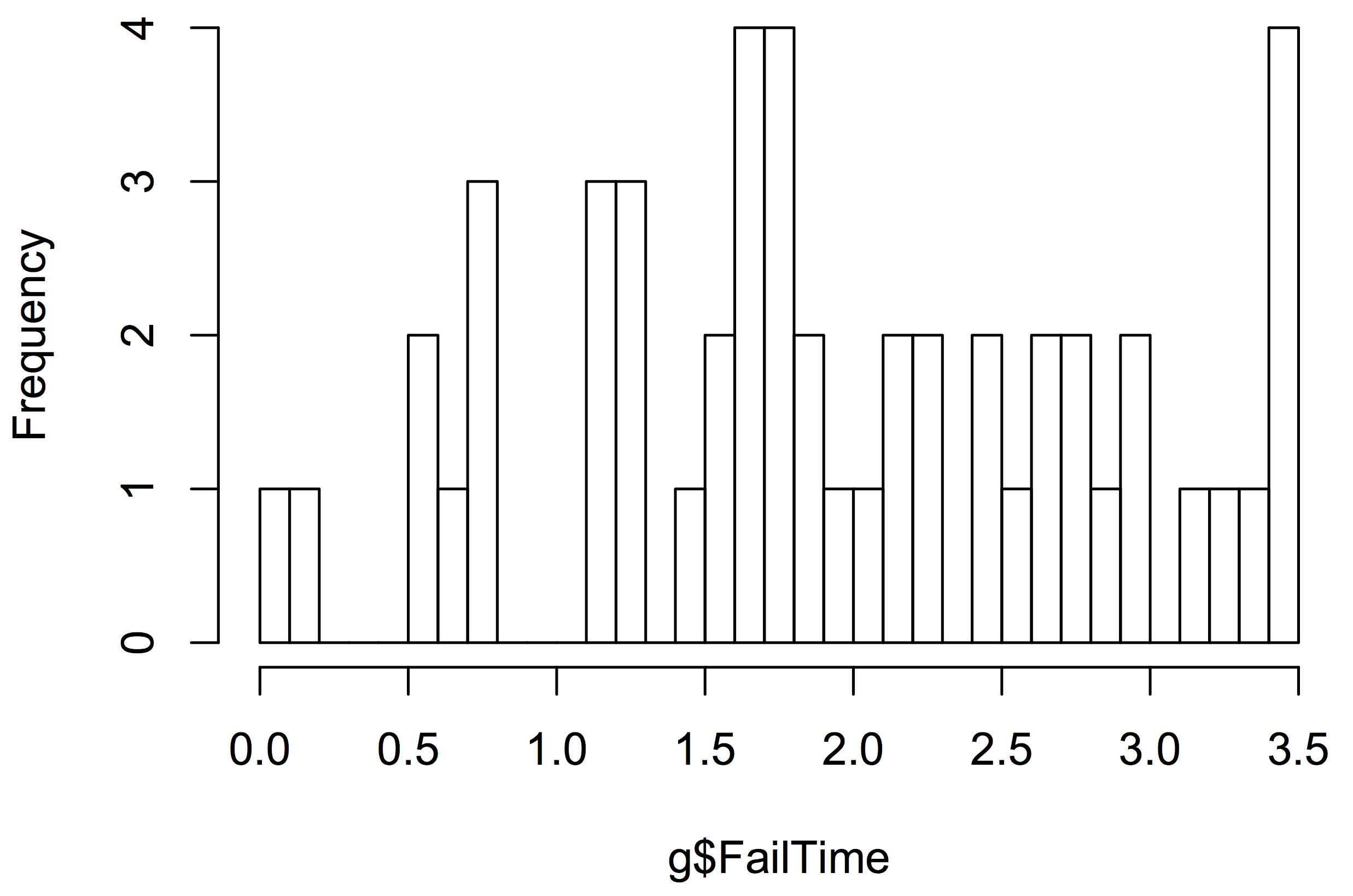
Consider an outlet store that purchased used display panels to refurbish and resell. The relevant statistics for failure time of the sample are \(n=50, \overline{y}=1.9350, s=0.92865\).
But these are the only necessary numbers to solve the problem. The standard error, .1313 can be calculated from \(s/\sqrt{n} = 0.92865/\sqrt{50}=.1313.\)
First, find the 95% confidence interval, which can be calculated from the above information. Since the sample is greater than or equal to 30, we use the large sample formula: \[\begin{align*} \overline{y}\pm z_{\alpha/2} \sigma_{\overline{y}} \approx \overline{y}\pm z_{\alpha/2} \frac{s}{\sqrt{n}} &= 1.9350 \pm 1.96 (.1313) \\ &= 1.9350 \pm 0.2573 \\ &= (1.6777,2.1932) \end{align*}\] The correct answer to a question asking for the confidence interval is simply that pair of numbers, 1.6777 and 2.1932.
Now interpret that. This result says that we are 95% confident that the true average time to failure for these panels is somewhere between 1.6777 years and 2.1932 years. It is tempting to rephrase the result. Be careful that you don’t say something with a different meaning. Suppose the store wants to offer a warranty on these panels. Knowing that we are 95% confident that the true mean is in the given range helps the store evaluate the risk of different warranty lengths. The correct answer is to say that we are 95% confident that the true mean time to failure for these panels is somewhere between 1.6777 years and 2.1932 years.
The meaning of the 95 percent confidence interval is that, if we repeatedly resample the population, computing a 95% confidence interval for each sample, we expect 95% of the confidence intervals generated to capture the true mean.
Any statistics software can also offer a graphical interpretation, such as a stem-and-leaf plot or histogram. The stem-and-leaf plot uses the metaphor of a stem bearing some number of leaves. In the following stem-and-leaf plot, the stem represents the first digit of a two-digit number. The top row of the plot has the stem 0 and two leaves, 0 and 2. Each leaf represents a data point as the second digit of a two-digit number. If you count the leaves (the digits to the right of the vertical bar), you will see that there are fifty of them, one for each recorded failure time. You can think of each stem as holding all the leaves in a certain range. The top stem holds all the leaves in the range .00 to .04 and there are two of them. The next stem holds the six leaves in the range .05 to .09. The third stem holds all six leaves in the range .10 to .15. The stem-and-leaf plot resembles a sideways bar chart and helps us see that the distribution of the failure times is somewhat mound-shaped. The main advantages of the stem-and-leaf plot are that it is compact for the amount of information it conveys and that it does not require a graphics program or even a computer to quickly construct it from the raw data. The programming website http://rosettacode.org uses the stem-and-leaf plot as a programming task, demonstrating how to create one in 37 different programming languages.
0 | 02
0 | 567788
1 | 122222
1 | 55666667888999
2 | 0223344
2 | 666788
3 | 00233
3 | 5555
Most statistics programs offer many different histogram types. The simplest is equivalent to a barchart as follows.
Testing a hypothesis must be done modestly. As an example of what I mean by modestly, consider criminal trials in the USA. The suspect on trial is considered innocent until proven guilty. The more modest hypothesis (the null hypothesis) is that the person is innocent. The more immodest hypothesis (the alternative hypothesis) carries the burden of proof.
The traditional view of the legal system in the USA is that if you imprison an innocent person, it constitutes a more serious error than letting a guilty person go free.
Imprisoning an innocent person is like a Type I error: we rejected the null hypothesis when it was true. Letting a guilty person go free is like a Type II error: we failed to reject the null hypothesis when it was false.
How do you identify rejection region markers? A rejection region marker is the value a test statistic that leads to rejection of the null hypothesis. It marks the edge of a region under the curve corresponding to the level of significance, \(\alpha\). The marker is not a measure of the size of the region. The rejection region marker can vary from \(-\infty\) to \(+\infty\) while the size of the region is somewhere between zero and one.
The following table shows the relevant values of \(\alpha\) and related quantities.
| \(1-\alpha\) | \(\alpha\) | \(\alpha/2\) | \(z_{\alpha/2}\) |
|---|---|---|---|
| .90 | .10 | .05 | 1.645 |
| .95 | .05 | .025 | 1.96 |
| .99 | .01 | .005 | 2.576 |
The above table refers to two-tailed tests. Only examples (e) and (f) below refer to two-tailed tests. In the other four cases, the \(z\)-scores refer to \(z_{\alpha}\) rather than \(z_{\alpha/2}\).
(a) \(\alpha=0.025\), a one-tailed rejection region
(b) \(\alpha=0.05\), a one-tailed rejection region
(c) \(\alpha=0.005\), a one-tailed rejection region
(d) \(\alpha=0.0985\), a one-tailed rejection region

(e) \(\alpha=0.10\), a two-tailed rejection region
(f) \(\alpha=0.01\), a two-tailed rejection region
The test statistic is \(t_c\), where the \(c\) subscript stands for calculated. Most people just call it \(t\). In my mind, that leads to occasional confusion about whether it is a value calculated from a sample. We’ll compare the test statistic to \(t_{\alpha,\nu}\), the value of the statistic at a given level of significance, identified using a table or calculator.
The test leads to two situations. The first, pictured below, is the situation where we fail to reject the null hypothesis and conclude that we have not seen evidence in the sample that the point estimate differs from what the modest hypothesis claims it is. Often, this is an estimate of a mean, where the population mean, \(\mu_0\), is being estimated by a sample mean, \(\bar{y}\). The following picture doesn’t show \(\bar{y}\), just the tail. \(\bar{y}\) would be at the top of the hump, not shown here.
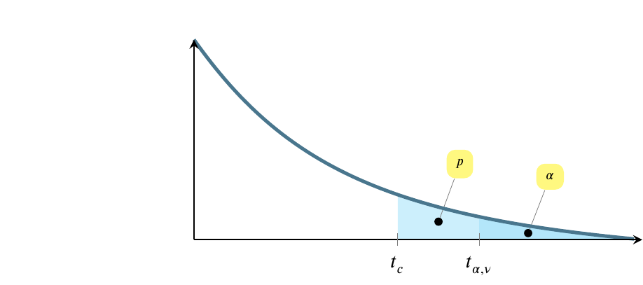
The above possibility shows the situation where \(t_{\alpha,\nu}>t_c\), which is equivalent to saying that \(p>\alpha\).
The \(x\)-axis scale begins to the left of the fragment shown here, and values of \(t\) increase from left to right. At the same time, the shaded regions decrease in size from left to right. Note that the entire shaded region above is \(p\), while only the darker region at the right is \(\alpha\).
The situation pictured below is the reverse. In this situation, we reject the null hypothesis and conclude instead that the point estimate does not equal the value in the modest hypothesis. In this case \(t_{\alpha,\nu}<t_c\), which is equivalent to saying that \(p<\alpha\).

Let’s make this more concrete with an example.
Suppose that a bulk vending machine dispenses bags expected to contain 15 candies on average. The attendant who refills the machine claims it’s out of whack, dispensing more than 15 candies on average, requiring more frequent replenishment and costing the company some extra money. The company representative asks him for a sample from the machine, so he produces five bags containing 25, 23, 21, 21, and 20 candies. Develop a hypothesis test to consider the possibility that the vending machine is defective. Use a level of significance that makes sense given the situation described above.
There are seven steps to solving this problem, as follows.
Step 1. Choose a null hypothesis.
At a high level, we can say that we are trying to choose between two alternatives:
We need to reduce this high level view to numbers. The problem states that the machine is expected to dispense 15 candies per bag, on average. This is equivalent to saying that the true mean is 15 or \(\mu=15\).
If the machine is defective in the way the attendant claims, then \(\mu>15\). So we could say that one of the hypotheses would be that the sample came from a population with \(\mu=15\) and the other hypothesis would be that the sample did not come from a population with \(\mu=15\). Which should be the null hypothesis?
The null hypothesis represents the status quo, what we would believe if we had no evidence either for or against. Do you believe that the machine is defective if there is no evidence either that it is or isn’t? Let’s put it another way. Suppose you arrested a person for a crime and then realized that you have no evidence that they did commit the crime and no evidence that they did not commit the crime. Would you imprison them or let them go free? If you let them go free, it means that your null hypothesis is that they are innocent unless proven guilty.
This suggests that if you have no evidence one way or the other, assume the machine is operating normally. We can translate this into the null hypothesis \(\mu=15\). The formal way of writing the null hypothesis is to say \(H_0: \mu=\mu_0\), where \(\mu_0=15\). Later, when refer to this population mean, we call it \(\mu_0\) because it is the population mean associated with the hypothesis \(H_0\). So later we will say \(\mu_0=15\).
At the end of step 1, we have chosen the null hypothesis: \(H_0: \mu=\mu_0\) with \(\mu_0=15\).
Step 2. Choose the alternative hypothesis. The appropriate alternative hypothesis can be selected from among three choices: \(\mu<\mu_0\), \(\mu>\mu_0\), or \(\mu \ne \mu_0\). The appropriate choice here seems obvious: all the sample values are much larger than \(\mu_0\), so if the mean we calculate differs from \(\mu_0\) it will have to be larger than \(\mu_0\). If all the values in our sample are larger than \(\mu_0\), there is just no way their average can be smaller than \(\mu_0\).
At the end of step 2, we have determined the alternative hypothesis to be
\(H_a: \mu>\mu_0\) with \(\mu_0=15\).
Step 3. Choose the test statistic. Previously, we have learned two test statistics, \(z\) and \(t\). We have learned that the choice between them is predicated on sample size. If \(n\geqslant30\), use \(z\), otherwise use \(t\). Here \(n=5\) so use \(t\). We can calculate the \(t\)-statistic, which I called \(t_c\) for calculated above, for the sample using the formula \[ t=\frac{\overline{y}-\mu_0}{s/\sqrt{n}} \]
We can calculate the values to use from the following formulas or by using a machine.
\[\overline{y}=\sum{y_i}/n=22\]
\[s=\sqrt{\frac{\sum y_i^2 - n(\overline{y})^2}{n-1}}=2\]
\(\mu_0\) was given to us in the problem statement and \(\sqrt{n}\) can be determined with the use of a calculator or spreadsheet program. The calculated \(t\)-statistic is \(t_c=(22-15)/(2/\sqrt{5})=7.8262\).
At the end of step 3, you have determined and calculated the test statistic, \(t_c=7.8262\).
Step 4. Determine the level of significance, \(\alpha\). You choose the appropriate value of \(\alpha\) from the circumstances given in the problem statement. Previously in class, I claimed that there are three common levels of significance in use as sumarized in the table on page 35: 0.01, 0.05, and 0.10. I gave rules of thumb for these three as 0.01 life-or-death, 0.05 money is riding on it, and 0.10 casual / low budget. In this case, the consequences seem to be a small amount of money lost by the company if they are basically giving away candies for free. I suggest that this is a case where some money is riding on it so choose \(\alpha=0.05\).
At the end of step 4, you have determined \(\alpha=0.05\).
Step 5. Identify the rejection region marker. This is simply a matter of calculating (or reading from a table) an appropriate \(t\)-statistic for the \(\alpha\) you chose in the previous step. This is \(t_{\alpha,\nu}=t_{0.05,4}=2.131847\). Note that \(\nu\) is the symbol the book uses for df, or degrees of freedom. It is a Greek letter pronounced nyoo. For a single sample \(t\)-statistic, df\(=\nu=n-1\).
This can be found using R by saying
qt(0.95,4)[1] 2.131847At the end of step 5, you have calculated the location of the rejection region (but not its size). It is located everywhere between the \(t\) curve and the horizontal line to the right of the point \(t=2.131847\).
Step 6. Calculate the \(p\)-value. This is the size of the region whose location was specified in the previous step, written as \(p=P(t_{\alpha,\nu}>t_c)\). It is the probability of observing a \(t\)-statistic greater than the calculated \(t\)-statistic if the null hypothesis is true. It is found by a calculator or app or software. It can only be calculated by hand if you know quite a bit more math than is required for this course. In this case \(p=P(t_{\alpha,\nu}>t_c)=0.0007195\).
We can identify both \(t_\alpha\) and \(t_c\) using R as follows:
#. t sub alpha
qt(0.95,4)
[1] 2.131847#. find the alpha region associated with t sub alpha
1-pt(2.131847,4)[1] 0.04999999x <- c(25,23,21,21,20)
t.test(x,alternative="greater",mu=15)
    One Sample t-test

data:  x
t = 7.8262, df = 4, p-value = 0.0007195
alternative hypothesis: true mean is greater than 15
95 percent confidence interval:
 20.09322      Inf
sample estimates:
mean of x
       22
Also note that the \(t\) test tells us that the true mean is far from 15. If we tested repeatedly, we would find that it is greater than 20.09322 in 95 percent of the tests.
At the end of step 6, we have calculated the \(p\)-value, \(p=P(t_{\alpha,\nu} > t_c)=0.0007195\).
Step 7. Form a conclusion from the hypothesis test. We reject the null hypothesis that \(\mu=\mu_0\), or in other words, we reject the hypothesis that these five bags came from a vending machine that dispenses an average of 15 candies per bag. Notice we don’t that the machine is defective. Maybe the data were miscounted. We don’t know. We have to limit our conclusion to what we know about the data presented to us, which is that the data presented to us did not come from a machine that dispense an average of 15 candies per bag.
To summarize the answer, the seven elements of this statistical test of hypothesis are:
Let’s return to the two pictures we started with. Notice that \(p<\alpha\) in this case, which is equivalent to saying that \(t_c>t_{\alpha,\nu}\), so we are looking at the second of the two pictures.