HCI:
Analytic Evaluation

Mick McQuaid

2024-03-28

Week TEN

Today

Q and A from last time

Learning

Honestly all the later discussion topics were great learning points, here are the most piked ones to me:

  1. The clear distinction of qualitative and quantitative data was quiet detailed. The example of the In-charge of Gmail dept. Changing the meaning of Reply and Reply All using the quantitative data as support.
  2. The reflection on the clarity of the goals is very important to avoid miserable user experience!
  3. The right time to collaborate engineers and HCI: “give engineers HCI tasks”
  4. The 5 E’s

When examining qualitative data versus quantitative data, we discussed their subjectivity, which I agree with. Both types of data are gathered and analyzed by researchers aiming to uncover insights, which they can influence based on the questions asked to retrieve the data. When exploring the nuances of qualitative and quantitative data, we need to acknowledge the interpretive role analysts have in shaping the findings derived from these datasets.

I think the most important thing was the class discussion about involving data scientists and how to collaborate between UX designers and software engineers.

Shout out to Rachel for teaching the part I always wanted to learn. And I will check Rocket surgery made it easy.

I learned a few important points today. At my job, when different departments need to collaborate and integrate, we often form cross functional teams and execute the task together. Giving each department goals/work from the partnering department is a good way to engage both groups, and help them relate to each other.

Another good reminder/lesson from today is to remember that although we are all users, we are not our users. It is important to put ourselves into the shows of the intended users.

Q&A

What can be the best situation to use Formative Evaluation or Summative Evaluation? Do we need both? If yes, then how much of each?

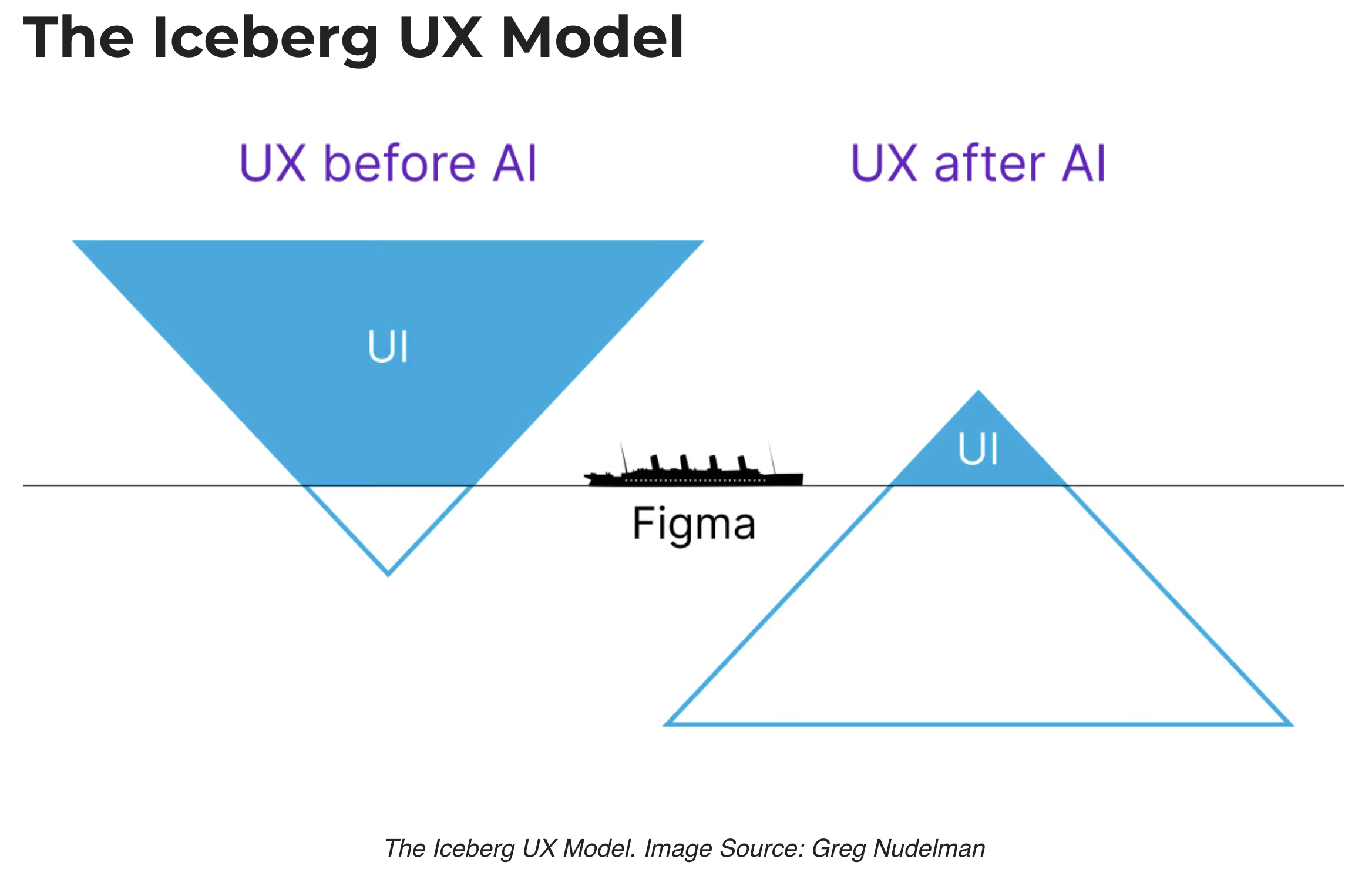
N/A, thank you Rachel for the figma tutorial!

I did a quick search when you mentioned Taylorism and its impact on efficiency, and there were a lot of negatives in terms of how its more aligned with getting people to work so hard and under strict supervision. I was wondering if this is what you meant? and if you think the concept is still being utilized in positive settings.

It sounds like the class had a preference for cross-training between disciplines to better communicate. Does this responsibility fall onto the person doing the work to try to facilitate this cross-training, should it be the company’s responsibility, and what happens if either group does not want to put in the effort to learn about the other discipline’s approaches or work?

What are the ways to evaluate your evaluation methods (like observation) to see if it is valid, rather than getting meaningless or inaccurate results?

Other than recruiting a large pool of users for a study, how can we replicate the diverse users that a product is intended for? (Due to cost or time constraints).

Discussion

Why is there not a recommended progression of classes? Then if you know the content from part of the progression you just skip over it?

Other than keeping it simple, what other strategies can be employed to streamline the documentation process during heuristic evaluations to avoid overwhelming evaluators?

Considering the progression from traditional to modern UX evaluation approaches, such as the shift towards more nuanced analytic and empirical methodologies, what aspects of today’s UX research practices might be viewed as antiquated by future professionals, especially in light of potential technological advancements such as AI?

How will AI change evaluation of video transcripts of interviews?

Will AI provide better results (less time-consuming and less biased) than manual coding of interview transcripts?

Should heuristic evaluation be left to experts? (What constitutes an expert?)

How do UX professionals navigate the contradictions between this user-centric ideology and the product-centric priorities that dominate many companies, where decisions are frequently driven by product features and technical capabilities rather than by user experience data?

Design Critique

  • My twenty-year-old camera bag!
  • It influences my choice of laptop!
  • I forgot I had it on my shoulder at the airport TSA chockpoint
  • It’s quiet and dependable and parts that wear out can be replaced
  • The design has been updated (I’ll show you)

Article Presentation

Setareh?

Prereqs

If you don’t know anything about ableism, disability identity, or the history of disability rights, check out https://mickmcquaid.com/accessibilitySlides.html

Initial interviews found …

… two forms of access inequality

  1. Access differential: the gap between the access that non/disabled students experience, and
  2. Inequitable access: the degree of inadequacy of existing accommodations to address inaccessibility

(reported in Shinohara, McQuaid, and Jacobo (2020))

Method

Reflexive thematic analysis (Braun and Clarke (2022))

Analytic Evaluation

Let’s look at HCI experiments

Readings

Readings last week include Hartson and Pyla (2019): Ch 22–24 Readings this week include Hartson and Pyla (2019): Ch 25–26

Assignments

Milestone 4

References

Braun, Virgina, and Victoria Clarke. 2022. Thematic Analysis: A Practical Guide. London: Sage Publications.
Hartson, Rex, and Pardha Pyla. 2019. The UX Book, 2nd Edition. Cambridge, MA: Morgan Kaufman.
Shinohara, Kristen, Michael McQuaid, and Nayeri Jacobo. 2020. “Access Differential and Inequitable Access: Inaccessibility for Doctoral Students in Computing.” In The 22nd International ACM SIGACCESS Conference on Computers and Accessibility. ACM. https://doi.org/10.1145/3373625.3416989.

END

Colophon

This slideshow was produced using quarto

Fonts are League Gothic and Lato