Stats: Data Summaries

Mick McQuaid

2024-01-20

Week TWO

Review

Rownames and column names

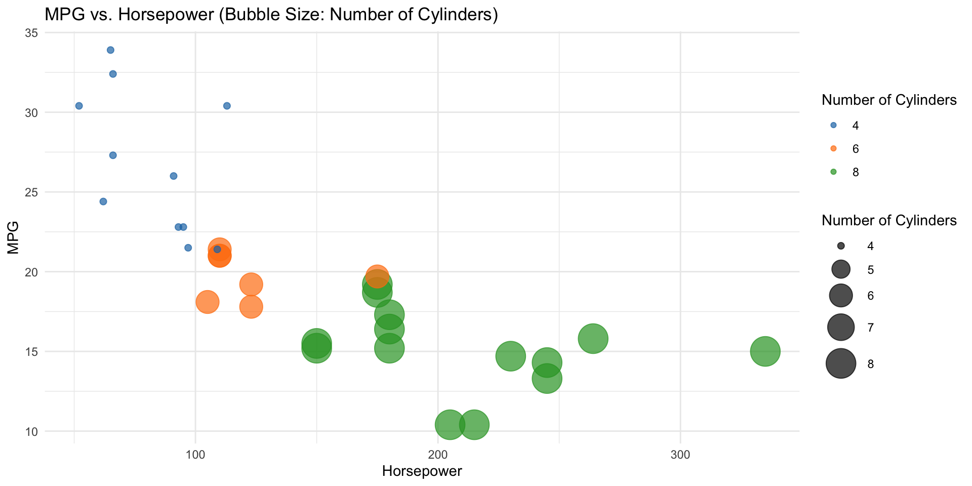
Note that R allows you to assign names to rows of a dataframe just as you can assign names to columns of a dataframe. We saw an example of that with the mtcars data, which appeared to have an extra column because the car makes and models were assigned as rownames.

Mean

  • arithmetic mean is the most popular measure of centrality
  • can be dragged away from the center by outliers
  • can be found by mean(vectorname) in R if vector is numeric
  • can find all means in dataframe with colMeans(df) or sapply(df,mean)

Means of some, but not all, columns

  • subsetting just the first, second, and fourth column colMeans(mtcars[,c(1,2:4)])
  • subsetting numeric columns colMeans(df[,which(sapply(df,is.numeric))])
  • subsetting numeric columns & rows where hp > 100: df<-mtcars colMeans(df[which(df$hp>100),which(sapply(df,is.numeric))])

Median

  • the middle value of a sorted vector if there are an odd number of elements in the vector
  • the arithmetic mean of the two middle values of a sorted vector if there are an even number of elements
  • can be found by median(vectorname) in R if vector is numeric

Standard Deviation

  • a measure of how spread out a vector is around its mean if vector is numeric
  • can be found in R by sd(vectorname)
  • is the square root of the variance
  • used in place of variance because it’s in the same units as the variable rather than squared units

More Numerical Summaries

Structure of a dataframe

  • say str(df) in R to get the following
    • number of rows
    • number of columns
    • names of columns
    • types of columns
    • examples of entries in each column

Summary of a dataframe

  • say summary(df) in R to get an entry for each column, containing
    • minimum, first quartile, median, mean, third quartile, maximum
  • above is for numeric columns
  • counts and level names for factors

Better summaries

pacman::p_load(vtable)
df <- mtcars
df[,c(1,3:7)] |> sumtable(summ=c('min(x)','median(x)','mean(x)','sd(x)','max(x)'),out='return')
  Variable Min Median Mean   Sd Max
1      mpg  10     19   20    6  34
2     disp  71    196  231  124 472
3       hp  52    123  147   69 335
4     drat 2.8    3.7  3.6 0.53 4.9
5       wt 1.5    3.3  3.2 0.98 5.4
6     qsec  14     18   18  1.8  23

Summarizing non-numeric data

First, get some categorical data …

options(digits=1)
load(paste0(Sys.getenv("STATS_DATA_DIR"),"/migraine.rda"))
str(migraine)
Classes 'tbl_df', 'tbl' and 'data.frame':   89 obs. of  2 variables:
 $ group    : Factor w/ 2 levels "control","treatment": 2 2 2 2 2 2 2 2 2 2 ...
 $ pain_free: Factor w/ 2 levels "no","yes": 2 2 2 2 2 2 2 2 2 2 ...

A contingency table

(tbl <- with(migraine,table(pain_free,group)))
         group
pain_free control treatment
      no       44        33
      yes       2        10

A bigger contingency table

load(paste0(Sys.getenv("STATS_DATA_DIR"),"/loan50.rda"))
with(loan50,addmargins(table(loan_purpose,grade)))
                    grade
loan_purpose             A  B  C  D  E  F  G Sum
                      0  0  0  0  0  0  0  0   0
  car                 0  0  1  1  0  0  0  0   2
  credit_card         0  6  4  1  1  1  0  0  13
  debt_consolidation  0  2  9  4  7  1  0  0  23
  home_improvement    0  1  4  0  0  0  0  0   5
  house               0  0  1  0  0  0  0  0   1
  major_purchase      0  0  0  0  0  0  0  0   0
  medical             0  0  0  0  0  0  0  0   0
  moving              0  0  0  0  0  0  0  0   0
  other               0  4  0  0  0  0  0  0   4
  renewable_energy    0  1  0  0  0  0  0  0   1
  small_business      0  1  0  0  0  0  0  0   1
  vacation            0  0  0  0  0  0  0  0   0
  wedding             0  0  0  0  0  0  0  0   0
  Sum                 0 15 19  6  8  2  0  0  50

Visual summaries

A picture of mtcars

#. install.packages("pacman")
pacman::p_load(tidyverse)
ggplot(mtcars, aes(x = hp, y = mpg, size = cyl, color = factor(cyl))) +
  geom_point(alpha = 0.7) +
  scale_size_continuous(range = c(2, 10)) +
  scale_color_manual(values = c("#1f77b4", "#ff7f0e", "#2ca02c", "#d62728", "#9467bd", "#8c564b", "#e377c2", "#7f7f7f", "#bcbd22", "#17becf")) +
  labs(x = "Horsepower", y = "MPG", size = "Number of Cylinders", color = "Number of Cylinders", title = "MPG vs. Horsepower (Bubble Size: Number of Cylinders)") +
  theme_minimal()

Preceding example

  • uses the tidyverse, a coherent set of packages
  • uses ggplot, the main function in that set of packages
  • uses the layered grammar of graphics, a philosophy of data visualization
  • graphics in this philosophy are built from reusable components

Visual summary of a vector

pacman::p_load(scales)
loan50 |>
  ggplot(aes(annual_income)) +
  geom_boxplot() +
  scale_x_continuous(labels = comma_format())

Visual summary of several vectors

loan50 |>
  ggplot(aes(annual_income,homeownership)) +
  geom_boxplot() +
  scale_x_continuous(labels = comma_format())

A similar visual summary

loan50 |>
  ggplot(aes(annual_income,homeownership)) +
  geom_violin() +
  scale_x_continuous(labels = comma_format())

Uncertainty in visual summaries

loan50 |>
  ggplot(aes(annual_income,homeownership)) +
  geom_boxplot() +
  geom_jitter( size=1.4, color="orange", width=0.1) +
  scale_x_continuous(labels = comma_format())

Uncertainty in a linear model

pacman::p_load(hrbrthemes)
df <- data.frame(
  x = 1:100 + rnorm(100,sd=9),
  y = 1:100 + rnorm(100,sd=16)
)
ggplot(df, aes(x=x, y=y)) +
  geom_point() +
  geom_smooth(method=lm , color="red", fill="#69b3a2", se=TRUE) +
  theme_ipsum()

In these parts, a man’s life may depend on a mere scrap of information.

— Clint Eastwood, in A Fistful of Dollars (1964)

END

Colophon

This slideshow was produced using quarto

Fonts are Roboto Condensed Bold, JetBrains Mono Nerd Font, and STIX2