HCI:
Affordance
Laws
Errors

Mick McQuaid

2024-04-04

Week ELEVEN

Q and A from last time

Learning

Figma! It was a great tutorial. Thanks Rachel

Setarehs presentation was very interesting, I never though of social media platforms as cities. I agree, it is scary how influential media is on every culture, I actually stepped away from a lot of social media during covid and noticed how much my life changed without it.

Truly, no one knows what is going to happen. Some people think AI is in the plateau, some people think the growth is just getting started. Our views on what the last pillar of humanity is to fall from AI. I think we are just getting started, and that AI (or AI like) will really disrupt many industries, and it was interesting to hear opposing views presented in class today from industry leaders at the conference.

Q&A

Nan

When thinking back on the discussion question “should heuristic evaluation be left to experts?”, my answer came to me moments later but I didn’t want to disrupt class. No, I don’t think heuristic evaluations should be left to experts. The only way one becomes an “expert” is through practice and a lot of failing. So we need non-experts to do these evaluations and learn from their mistakes and accomplishments. Do y’all agree?

One proposition brought up in class was that “We should deploy AI not when its perfect, but when its better than humans” I want to ask, would you implement AI at your work place?

  • What happens if it increases productivity?
  • What happens if it leads to record profits, but a 10% workforce reduction, would you still do it?
  • What happens if its only a 5% workforce reduction?
  • What happens if its a 0.1% (1 person laid off for every 1000)?
  • What happens if its you that is laid off?

UPS for example had the largest layoff in 116 years, totaling 12,000 workers. One of the reason the layoffs happened, as the CEO mentioned in an earnings call, was that machine learning allows salespeople to put together proposals without having to ask pricing experts for guidance.

Discussion

What kind of studies have been done regarding the emotional aspects of designs and how better do we incorporate this into an otherwise functional design?

What type of strategies have you used during any of your UX design projects that has helped you leverage affordances? How has this guided you in ensuring optimal user interaction and nurturing intuitive experiences across a range of digital interfaces and platforms?

… how do designers of more complex tech products, such as social media platforms, intentionally design features to navigate and influence the broader spectrum of user emotions, such as empathy, validation, or isolation? And what strategies might they use to ensure these emotional affordances contribute positively to user well-being and social interaction?

From Designing with the Mind in Mind Chapter 13, we learn of Fitts’s Law, which conveys the message that the larger your target on a screen and the nearer it is to your starting point, the faster you can point to it, the less mental effort required, and the more likely you are to hit the target. I find this to be a valid and applicable law, but I also find it interesting how there’s an equation that goes with it. You would think the concept of the law is enough, but I feel the equation complicates it. Do you imagine calculating the law when designing, or do you believe it’s only applicable in non-UX situations?

Consider the concept of cognitive affordance as discussed in the book. Reflect on a cultural object or symbol that holds a particular meaning in a culture but may carry a different meaning in another culture, for eg: The color white symbolizes purity, peace in Western cultures but signifies mourning, death in the Eastern cultures. I’m curious on how might these cultural differences impact the behavior or perception of individuals from different cultural backgrounds encountering this object or symbol?

What fundamental design principles should be implemented to ensure smooth and intuitive collaboration between human users and AI systems? This question becomes particularly relevant in situations where AI might exhibit ‘cognitive errors’—mistakes in processing or decision-making that either mirror human error patterns or deviate significantly from them. For example, in a healthcare setting where both doctors and AI-powered diagnostic tools work together, how can the interface design facilitate effective communication and decision-making between the two, ensuring that AI’s unique errors do not compromise patient care or safety?

The part about buttons in Chapter 13, reminds me of how we sometimes misjudge the user’s perception of buttons in design. Specifically, there were cases that users don’t think the buttons we design are buttons. This may came from the size, shape, style, position of buttons. For example, a fill-color component may be more like a button than a stroke component. I find that some visual symbols and language naturally bring users the impulse to interact. How do you understand this phenomenon? What other reasons may affect the user’s perception of buttons?

Is it accurate to suggest that the notion of affordance significantly contributes to usability in UX? I hadn’t previously considered it from this angle, but many of the concepts covered in this chapter appear to shape the design and usability of interactions. I’ve come to realize how vital it is, as designers can facilitate users in understanding possible actions and how to execute them.

I’d also hoped for constraints to be covered in greater detail, as I believe they are closely intertwined with affordances.

side note: Cognitive affordance took me down a rabbit hole of how did the first ever person get the ‘priori’ knowledge to just understand things.

Design Critique

  • My choice of laptop
  • I have a 16” M1 Macbook Pro, yet my daily driver is a six-year-old 12” Macbook! Why?
  • It has the vilified “butterfly” keyboard
  • It was denounced as underpowered on launch
  • It was denounced for lack of ports on launch

  • I’ve always had a tiny computer
  • Used to be Windows / Linux
  • Contrast between Microsoft approach and Apple approach:
    • Apple—make a product so good that you want to use it no matter what your boss says
    • Microsoft—convince your boss to force you to use their product, regardless of quality

Article Presentation

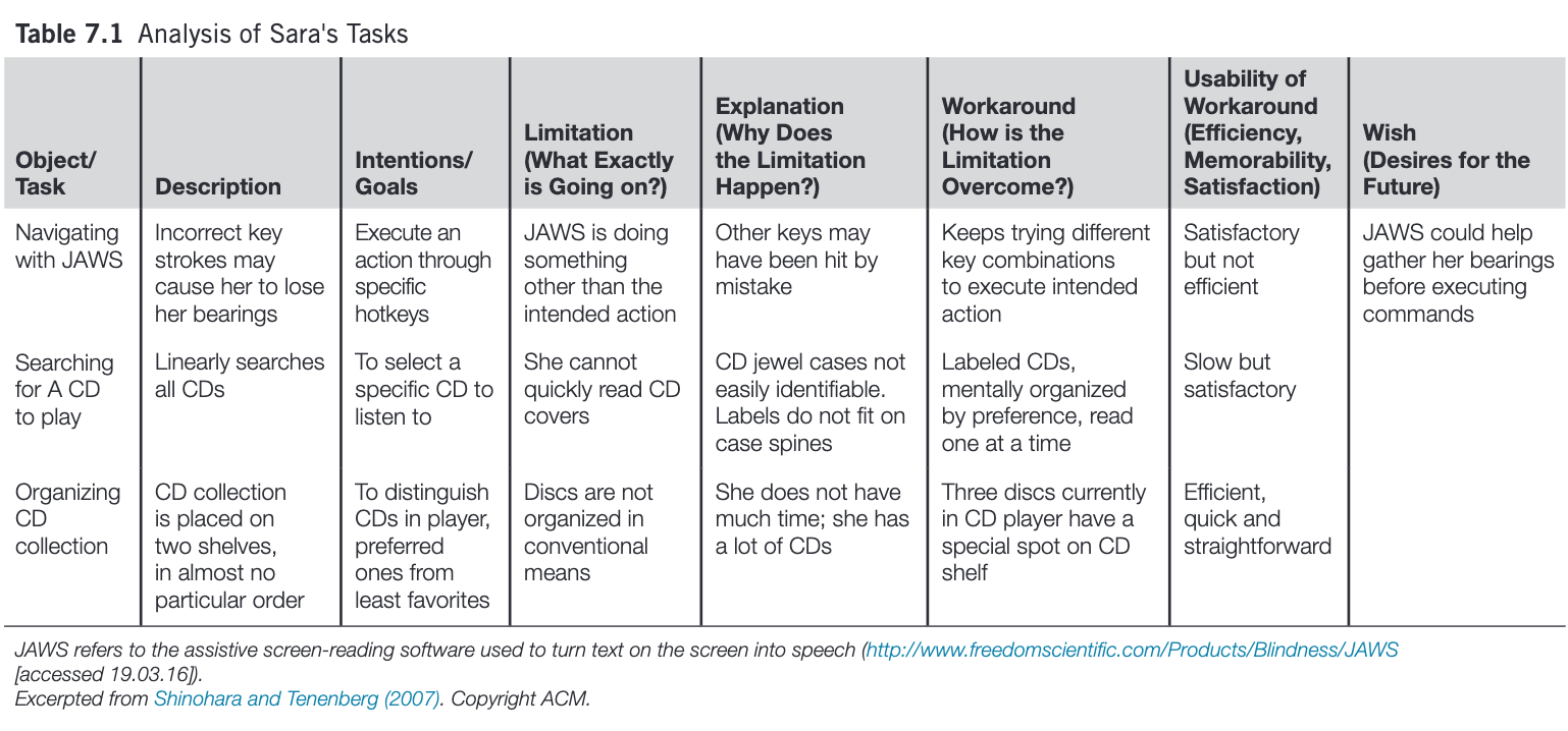
Observing Sara, Shinohara and Tenenberg (2007)

Observing Sara

Shinohara and Tenenberg used a series of semistructured interviews to collect the observations that form the basis of the case study. In a series of 6, 2-hour sessions in her home, Sara (not her real name) demonstrated how she used technologies such as tactile wristwatches and screen readers; discussed early memories of using various objects and her reactions to them; and imagined improved designs for various objects or tasks. Notes, audio recordings, interviewer reactions, and photographs from these sessions provided the raw data for subsequent analysis. Insights and theories based on early observations were shared with the subject for validation and clarification.

Sara’s CD Collection
Affordances

Norman campaigned for years to get people to distinguish between affordances and signifiers.

Laws

  • Fitts’s Law, \(t=a + b \log_2(1+D/W)\)
  • Hick’s Law, \(t= b \log_2(n+1)\)
  • Steering Law, \(t=a + b(D/W)\)

Errors

  • slips: action-based, memory lapse
  • mistakes: rule-based, knowledge-based, memory lapse

The difference is in whether the goal is correct (slips) or incorrect (mistakes)

Readings

Readings last week include Hartson and Pyla (2019): Ch 25–26 Readings this week include Hartson and Pyla (2019): Ch 30, Johnson (2020): Ch 13, Norman (2013): Ch 5

Assignments

Informal Project Presentation

References

Hartson, Rex, and Pardha Pyla. 2019. The UX Book, 2nd Edition. Cambridge, MA: Morgan Kaufman.
Johnson, Jeff. 2020. Designing with the Mind in Mind, 3rd Edition. Cambridge, MA: Morgan Kaufman.
Norman, Donald A. 2013. The Design of Everyday Things, 2nd Edition. Basic Books.
Shinohara, Kristen, and Josh Tenenberg. 2007. “Observing Sara: A Case Study of a Blind Person’s Interactions with Technology.” In Proceedings of the 9th International ACM SIGACCESS Conference on Computers and Accessibility, 171–78. Assets ’07. New York, NY, USA: ACM. https://doi.org/10.1145/1296843.1296873.

END

Colophon

This slideshow was produced using quarto

Fonts are League Gothic and Lato